- Introduction
- Chapter 1: Affect Theory
- Chapter 2: Case Study
- Chapter 3 – Analysis
- Conclusion
- Bibliography
- List of Illustrations
- Appendices
Introduction
As an autistic artist, I find that I am drawn to the perception of art and how fascinating other people’s perceptions can be compared to my own. I have always loved being able to showcase my work, whether it is the objects I craft or the stories I write, and seeing how others react to my work along with hearing about what they perceive. This also allows me to have a more complex understanding of emotion and how others feel since “empathy is like a universal solvent. Any problem immersed in empathy becomes soluble.” (Baron-Cohen, 2011). In this independent inquiry, I will be researching the topic of Affect Theory which is a theory that dedicates itself to capturing emotions and feelings, especially affects, which are essential to communication and understanding” (Mcleod, 2020). With this research, I will create a case study on the application of Affect Theory in my work to see how the augmentation of a piece of art can alter how it is perceived. The data collected and analysed from this case study will allow me to further my understanding of perception as well as give me more insight into how I can evolve my work to new standards that can be perceived in new innovative ways.
Chapter 1: Affect Theory
When considering what topics to use for the basis of my independent inquiry, I wanted something that fully encompasses who I am as an artist. With my work, I love to blend craft and narrative to tell a story whether it is through unique structures, vibrant colours or characterisations of abstract concepts, such as emotion. Here is where I found Affect Theory and knew it would be the ideal choice due to its concept of capturing emotion and effectively dedicating itself to the feelings of the viewer. In this chapter, I will be discussing key thinkers of Affect Theory, such as Silvan Tomkins and Maurice Merleau-Ponty, as well as research in more detail various ways on how we can perceive emotions. This will allow me to have a more structured understanding of Affect Theory as a whole and create a base for my case study.
Key Thinkers of Affect Theory
When researching the topic of Affect Theory, the first key thinker that stuck out was Silvan Tomkins. Tomkins was a 20th-century psychologist and personality theorist who developed both Script Theory and Affect Theory, along with primarily having research focused on topics such as emotions, cognition and consciousness. His theories on the subject of affect and emotion allowed for the inspiration for the use of affect to be applied to disciplines outside of psychology including subjects in art, humanities and social sciences. In recent years, Tomkin’s work on Affect Theory has been clearly outlined in the form of a handbook by Adam J. Frank, an English professor at the University of British Columbia. This handbook allows for Affect Theory to be accessible to all students and scholars with an interest in affect, showcasing conceptual innovations and key terms used by Tomkins which can be used to build a solid foundation for further theories on the subject of emotion and affect.
Another key thinker that became apparent in my research into Affect Theory was Maurice Merleau-Ponty, who was a well-renowned French philosopher who specialised in technical works based on the topics of phenomenology and psychology. Merleau-Ponty was also known for his work on the analysis of experiences, perceptions and difficulties of human existence which in turn caused his work to be often associated with existentialism. His early work titled ‘Phénoménologie de la perception’ (Phenomenology of Perception) became a staple work for studies dedicated to the understanding of perception, as well as the notion that when taking the existential elements of how emotions are perceived into account, affect has more capability to be fully understood under experimental pretences.
Using both the works of Tomkins and Merleau-Ponty as core research into the topic of Affect Theory, I am granted the ability to cover all grounds surrounding emotion, perception and the overall human experience. Their work allows for the subject of Affect Theory to be easily looked into and researched through a psychological viewpoint as well as the ability to adapt the themes in a way so that they can be applied to art and look into how people perceive it. Other key thinkers that can also be applied when thinking about research into the topic of Affect Theory include Edmund Husserl, Jean Baudrillard and John Berger. These men all have work that is based around the concepts of perception, looking at the different ways we as humans perceive the world and what it has to offer.
Perceptions of Emotions
When using emotion as a focus for creativity, it is difficult not to take into consideration how we can alter our perceptions of them. Considering how expansive the human brain is, the way we can experience emotion is not linear but more three-dimensional due to our ability to perceive with imagination and through all of our senses. Personally, with my love of narrative, I tend to characterise the majority of things I perceive. Whether it is physical shapes or abstract constructs, my mind tends to piece things together and create a quirky personification to allow an easier understanding of what I am perceiving. This type of perception is popularly used in animation, where they create stories centred around the personification of abstract concepts like emotion and personality. An example of this would be Inside Out (2015), a film that characterises emotions in the mind of a child, where they explore the mind as it begins to change during a life-altering event. This film allows for the perception of emotion to be simplified in a way that makes it easier for people, especially younger audiences, to understand what emotion is like and how it affects the mind.

When people first think about emotion, they primarily jump to thinking about facial expression as this is the easiest way to convey an emotional response. However, it is easy to forget that our other senses allow us to express emotions in different ways. One of these is our olfactory system’s ability to derive an emotional response from various types of aromas and smells. Many people tend to unconsciously link memories to certain kinds of scents which can elicit an emotional response, either positive or negative, when they perceive that smell again. Emotional experiences tied to scent in this way can also influence mood, leading to practices such as aromatherapy becoming increasingly popular along with people’s incessant need to collect candles. Studies in the U.S. show that there are an estimated more than 10,000 different candle scents available to consumers and more than 1 billion pounds of wax are used in producing candles sold each year (National Candle Association, 2021). With this growth in demand for new scents and experiences from candles, it is clear that olfactory emotional responses are more commonly known even if we do not realise it.

Another way we convey emotional responses, both consciously and unconsciously, is through auditory means. A more common practice of this emotional response is through the medium of music, in which we manipulate and synthesise tones and melodies to create an emotional interpretation of sound. The use of music is also used as a method of regulating emotion, whereas classical styles can evoke a sense of peacefulness and soothe a listener. Alternatively, we also tend to amplify our emotional responses with auditory reactions, combining sounds with facial expressions to convey how we are feeling. An example of taking an emotional response to be conveyed stronger can be described as adding a laugh to a smile to show greater joy or adding a scream to a frightened look to convey more fear. Rather than auditory emotional responses standing on their own, they are greatly amplified with the addition of facial expression which allows people to perceive the emotion to a stronger degree than they would if it were just the facial expression alone.
Applications of Affect Theory
The use of Affect Theory has primarily been applied to disciplines in psychology since its creation, but over recent years it has been adapted and applied to topics in the arts. Using Affect Theory in this way allows for studies to be created that look into how we perceive emotion when reacting to various media such as art, film and literature. In 2017, a journal based on this application of Affect Theory was created titled Measuring Aesthetic Emotions: A Review of the Literature and a New Assessment Tool. (Schindler, 2017). This journal studies the cognitive process of perceiving emotion from an aesthetic viewpoint and the creation of an aesthetic emotion scale, known as Aesthemos (Schindler, 2017), which is used to measure levels of intensity or frequency of aesthetic emotions. This scale includes a total of 42 different emotional feelings that have a range of 1 to 5 to allow a user to indicate either how intensely or often they felt the emotion when perceiving a chosen piece of media.
Another application of Affect Theory is a journal published by Cindy and Eddie Harmon-Jones, who wrote about a study they conducted looking at the empirical importance of discrete emotions. The journal titled The Discrete Emotions Questionnaire: A New Tool for Measuring State Self-Reported Emotions. (Harmon-Jones, 2016) uses the applications of prompts and scenarios designed to elicit specific types of emotional responses, and showcases what kinds of data can come from giving these prompts and scenarios to participants in the form of a questionnaire. The study shows that even if a scenario is created to elicit a specific type of emotion, people can also primarily feel a different way than expected. For example, If someone was shown a photo that would make one person angry, that same photo could also elicit a fearful or disgusted response from someone else. The perception of emotion can be subjective in this way and it is intriguing to see what kind of responses I could get when I apply Affect Theory to my work
From the applications of Affect Theory mentioned above, I intend to create my case study using my work as a focal point to elicit various kinds of emotional responses. However, rather than creating scenarios or applying work of my own to an Aesthemos type of scale (Schindler, 2017), I want to use pieces of work that were made surrounding the perception of emotion but with the experimentation of augmenting them to change the way they look. With these augmentations, the context of the pieces will be different which in theory will cause viewers of the work to perceive them in a completely new way than they were originally designed. Hopefully, after this case study is conducted, I will have better insight into the perception of emotion and the benefits of the application of Affect Theory in art.
Chapter 2: Case Study
After conducting my research into the subject of Affect Theory, I created a case study surrounding my work and how augmenting aspects of it can change how it is perceived. To achieve this, I created 3 questionnaires that were each distributed to 3 different groups of people so that one person would not be able to do the same questionnaire twice. The images used were the same in concept, but each questionnaire had a shift in how they were perceived. The baseline was showcasing the images on their own whereas the other two were examples of taking something away (Greyscaling the images to negate colour) and adding something new (Implementing narrative to provide more context). There was also the addition of a clear deadline to allow for the data collected to be capped at a certain point, as well as allowing a set time for distribution.
Before creating these questionnaires and sending them off respectively, I hypothesised that emotions would be the hardest to perceive without colour and then would progressively become more recognisable when colour and narrative were reintroduced. All raw data collected from this study can be found in the Appendix (See Appendix D).
Case Study 1 – Colour
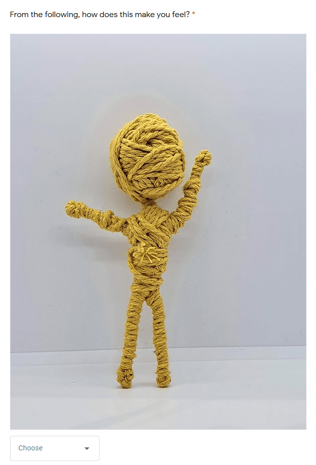
A few years ago, I was tasked to create a project around the topic of Tabula Rasa and the subject of a blank slate. I took this brief and studied concepts surrounding perception, Colour Theory, and emotion and applied them to create a series of pieces. These pieces were personifications of emotions, sins and virtues in the forms of string dolls to allow them to be seen in a simplified way through the means of colour and body language (See Appendix B). I used this project as the basis of my case study as it was the perfect example of work that showcased the perception of emotion while also having room to augment it to allow new ways for the work to be perceived.

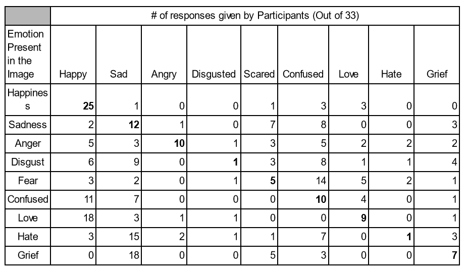
The table above shows the accumulated results of how many responses were given to each question in case study 1. Using the original pictures of the pieces, I created a control group for my case study by just using the personification of emotions without any context of which one was which. The questions provided only had pictures of the pieces for the participants to answer what their immediate emotional reaction was to the image. To allow for the data to remain simplified, the participants were given a drop-down menu containing one-word answers to discern how the image made them feel. The questions were also randomised for every participant so that there would be no contamination in the data from word-of-mouth discussion of the answers if in the case two or more participants were to ask each other what the other person answered. The images themselves were original images of the pieces without any augmentation (See Appendix B). My research into Colour Theory and body language are the only context clues to discern which emotion is represented in each image. This is due to the pieces being assigned colours that were best associated with the emotion along with what kind of physical poses and stances people tend to make when exhibiting a certain emotion.
With these parameters put in place, I sent out this study to a distribution group of 33 people, primarily composed of friends and family. I chose to create this distribution group for this specific case study because a lot of my family only had a context of what my work was through word of mouth and not through visual representation. Knowing this, I knew that showing my work visually without any written context would be a perfect way to get a genuine reaction of how participants would react emotionally to the images while also not knowing what the images represented. The only context they were provided was in the introduction to the case study form that they were given (See Appendix A).
Case Study 2 – Greyscale
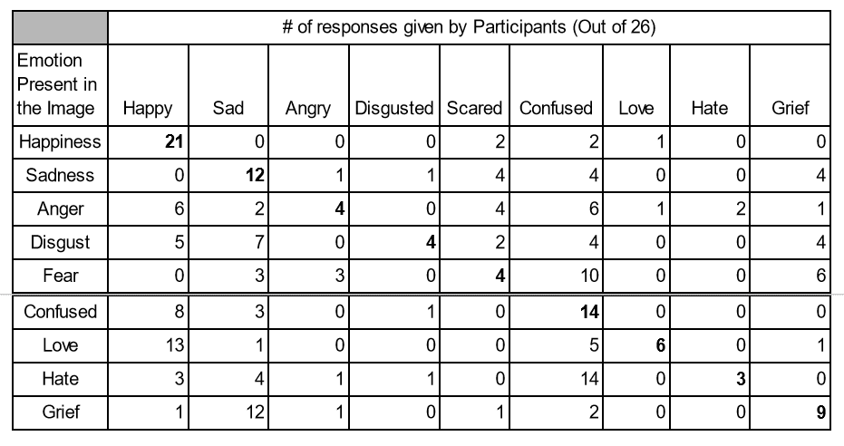
When considering how to augment my work to create variable case studies, I knew that taking it back to a base construct would be a great place to start. However, stripping away elements of work that is already minimalist has its limits. I decided that the best way to experiment with what kind of aspects I could take away would be to eliminate the colour in the images. The use of greyscale allows for a more refined look as well as forces the participants to rely on tones and textures to help piece together what used to be there.
The table above shows the accumulated results of how many responses were given to each question in case study 2. In this case study, I formatted the questionnaire in the same way, using the same question layout and answers so that there would be consistency across all participants no matter what questionnaire they were given. The original images used in the first case study were applied but augmented to have all of the colours within the pieces taken away so that the only tones perceivable were black, white and grey. Using this method takes away the context of Colour Theory, allowing participants to elicit emotional responses by reacting to body language alone without any other way of discerning what the image represents. The greyscaled images can be found alongside the original images (See Appendix B) to showcase a comparison of what the images look like both with and without augmentation.
With the changes made to the images, I distributed this study to a group of 26 people that consisted of tutors and students across my course. I chose this group for this study due to participants already having both written and visual context as to what my art represents. Having them take the questionnaire with the images being stripped down to the bare minimum of what they represent, whilst also having minimal context as to what the images were, assured me that the immediate reactions given would be ideal for the parameters that I had set.
Case Study 3 – Narrative
For my final case study, I chose to take my work one step further and add to it rather than strip elements away. I knew that the best way to finish my case studies would be to create a study that added more context than the original pieces ever received. Originally, the pieces themselves only had the names of the emotions that were tied to the body language and colour they were allocated. Since that project, I have been working on my contextual writing skills and began writing narratives for each of them to allow more depth and to bring them to life in my unique way. Adding narrative and extended characterisation to the personified emotions, allowed me to give the viewer of my work more context to the pieces themselves as well as a new way to imagine and perceive what the characters look like in their own image.
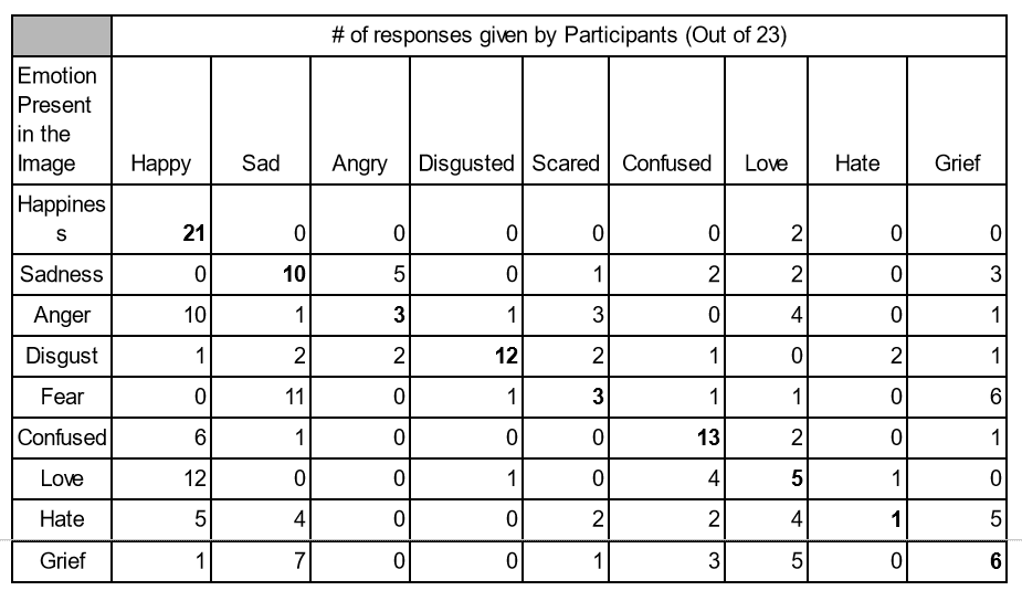
The table above shows the accumulated results of how many responses were given to each question in case study 3. With the layouts of my previous studies already included, I tweaked them to be able to fit the criteria needed for this study. With this study, I added a small character introduction to each question before introducing the picture of the piece it was associated with. Each character introduction was written specifically with the intent to not give anything away about the emotion it represents but to give enough context to allow the participant to have clues to attempt to piece it together themselves. With the addition of Colour Theory and body language context clues, the participant of the case study will have the full experience of what I intended the project to be when I first created it, along with added details that I have been developing for years since its first creation. Having the project come full circle and be presented in this way while also getting the ability to hear feedback on the work is an incredible opportunity. The character introductions of the personified emotions can be found in the Appendix (See Appendix C)
With this adjusted questionnaire format and preexisting parameters, I sent out this case study to a third unique dispersal group of strangers with whom I had no connection at all. I wanted this case study to be given to participants who had no previous context about my work or who I even was as a person or an artist. I wanted participants who had no context about me to have the full experience of my work at its highest potential level of augmentation that included both colour and narrative implements. To achieve the ideal distribution group for this study, I tasked a close friend of mine to disperse the questionnaire amongst a variety of social groups unknown to me. Using this method, I have no links to the participants as I did with the other dispersal groups, giving me a fresh perspective. While looking at data and not having the inkling of trying to figure out who is who amongst the anonymous results.
Chapter 3 – Analysis
After sending out all of the case studies and collecting data until the decided-upon deadline, I took it upon myself to look at the data from all angles to find out what I loved most about how the work was perceived as well as how the work itself evoked different emotional responses from the participants. In this chapter, I will be comparing the results given across all of the case studies and comparing them to my original hypothesis to discover differences along with interesting trends that I found when conducting the analysis. All charts and graphs created in the process of analysing the data can be found in the Appendix (See Appendix E).
The Colour Confusion Dip
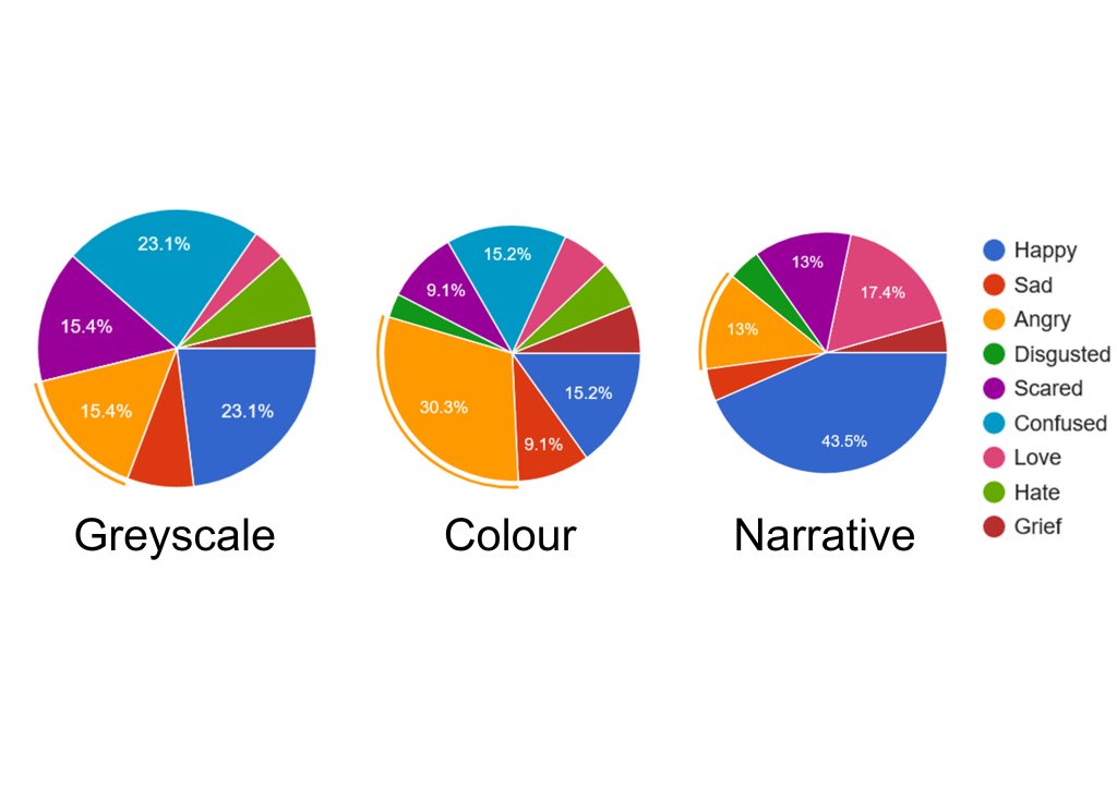
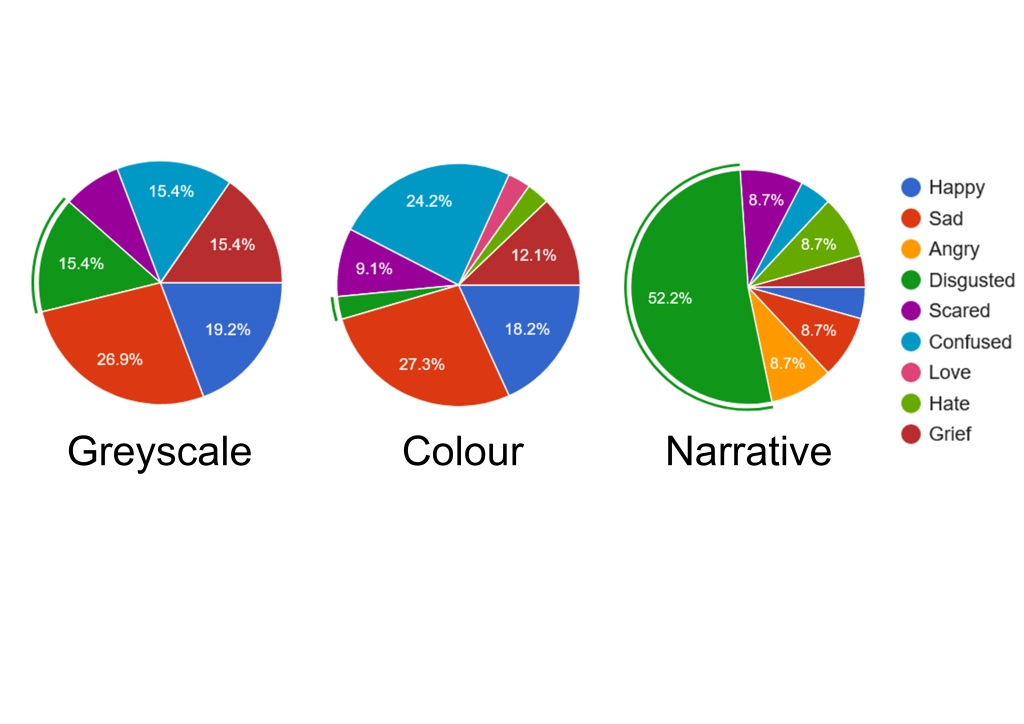
Before I created my case study and its accompanying questionnaires, I set up a hypothesis on how I thought the data would turn out after the studies had been conducted. I predicted that the pieces shown in the questionnaires would be harder to perceive without their colour but results would increase progressively when the addition of more context clues, such as colour and narrative, would be introduced. However, after analysing the data across all the case studies, I found that there was not a progressive trend like I hypothesised but a strong recognition of emotion from Greyscale and Narrative but a strange dip in results when colour was reintroduced.
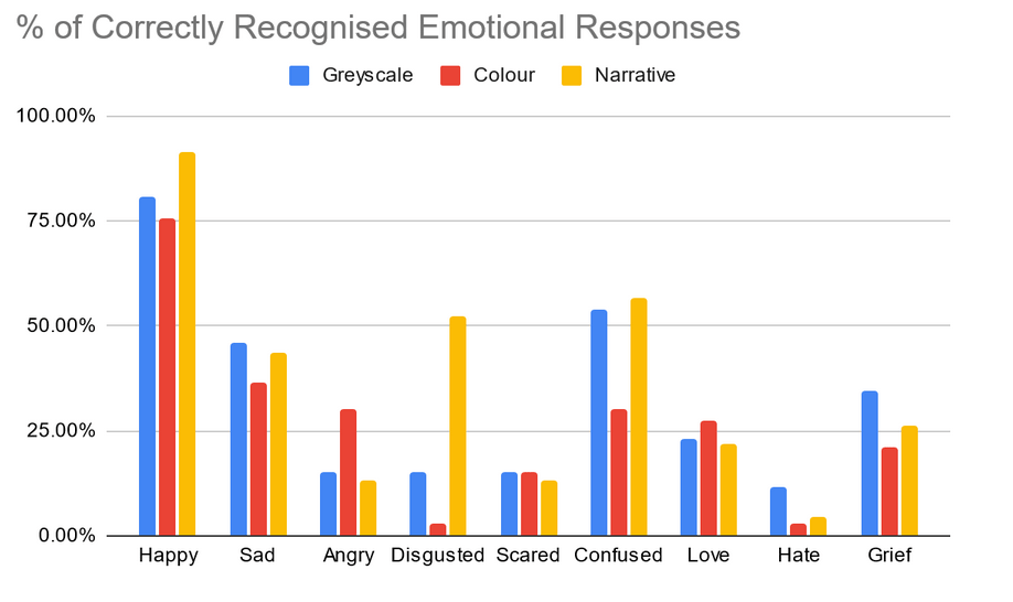
As you can see from the chart above, the data collected from the colour case study shows that the personified emotions in that state of context were the hardest to perceive, which according to the data were found to be more recognisable. In this context unlike in other case studies, the use of colour dips when compared to the results given from the case studies where context was both added and taken away. Since the colour case study was the original way the work was perceived, it is hard to determine why this dip has occurred in the data. The only logical conclusion I could come to was only having the colour for the context of what kind of response could be given, participants of this study would either find themselves confused or grow a bias for the colour they see and have an emotional response to the colour rather than the piece itself. Comparing this to the results of the other case studies helps this logical response as with the greyscale study, the use of colour was not apparent so no bias could be formed whereas, with the narrative case study, participants were given additional context with each piece so they would not find themselves confused and fall into the cycle of colour bias.
Furthermore, I am intrigued that this dip has occurred in my data as it has allowed me more insight into how colour can be perceived and that depending on the opinion of certain colours, the perception can alter from what I originally planned for that colour to be perceived when implemented into my work. Now with the knowledge learned from this strange occurrence in data, I understand a lot more about the perception of colour than I did previously and hope to implement this newfound knowledge into future pieces of work. I hope to further create more pieces around this subject so that I know what kind of emotional responses I can evoke when using specific tones and shades of colour in my work. That way If I were ever to conduct this case study again, the colours used would be more refined and the results would theoretically line up with my original hypothesis.
Most and Least Recognised Responses
When analysing the data of all the case studies, I looked across them all to find out which emotional responses were given by participants lined up with the personified emotions shown in the images of the questionnaires. I discovered that the two emotions that were recognised the most and least contrast each other in a unique way which I found to be quite interesting. As you can see from the charts below, the most recognised personified emotion across all three case studies was Happiness which on average approximately 83% of participants had a happy response when shown the image of happiness personified. This could be due to the colour yellow being a strong synonymous link to the emotion as well as the joyous pose that the personification was positioned in.

Conversely, when comparing results across the case studies I found that the least recognisable emotion was Hate which was recognised by participants with its corresponding response on average around 6%. Originally, I thought this to be quite strange as I consider hate to be a strong and well-known emotion and distinguished it to be quite recognisable. However, upon comparing the images provided for hate (See Appendix B), I discovered that it was difficult to discern what emotion was present in the images due to the similarity in tone between the greyscale and colour versions as well as the position the personification is placed in can be difficult to figure out along with being confusing if you do not have the context for what it is.
Therefore, after looking at the most and least recognised emotions and comparing their results to one another, I think that when it comes to personifying emotions, without the context of a narrative, it is key for the pieces themselves to stand on their own and be recognisable in their way. I hope to achieve this by refining Colour Theory in the future to find more specific tones that resonate with the emotion more clearly, as well as developing my knowledge of body language and figuring out new ways to position characters in hopes of having the emotion they represent to be more striking and recognisable. This will allow me to have a more diverse portfolio of colour selections along with new and innovative ways of bringing characters to life and having emotion in a piece to be perceived in a completely new and unique way.
Most Common Response
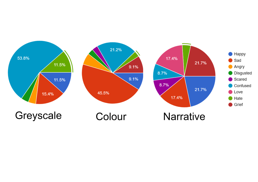
When compiling all of the charts together to present (See Appendix E), I discovered something interesting when having the ability to see it all in one colourful place rather than skimming through the data in a table format. I found that across the 3 case studies which each had 9 questions, out of those 27 questions the emotional response of Confusion was present in 25 of them. Along with this discovery, I learnt that Confusion was the second most recognised personification across the case studies averaging 46% of responses from participants recognising it when confusion was shown to them. Finding this out was certainly peculiar but it struck my interest enough to look deeper and figure out why Confused was the most common response given across the case studies. To do this, I would be combing through and analysing the raw data (See Appendix D).

Looking deeper into the data itself, I found that participants would often answer with Confused multiple times when asked for their responses. This is because, with the format of my questionnaires, I wanted the ability to have an answer not be locked out if it was already used in another response. I wanted the answers that came through to be genuine first reactions and taking away restrictions of only answering with a certain answer once was the perfect way to achieve that. It also helped me perceive how others could feel the same way about one piece as they would about another rather than only feeling a certain way about each piece specifically. After finding that Confused was the most common response, I figured out that this kind of response is a valid form of feedback due to the augmentation of perception throughout all the case studies as well as the experimentation with the use of context. By limiting what types of context the participants would be exposed to, depending on the study, the logical response to having as a first reaction would be Confused due to the lack of context of the pieces themselves and what they are supposed to represent.
Following this evidence, I believe that confusion would be an accurate first response when shown something with little context and asked how it makes you feel. If anything, finding this out has taught me that when it comes to the perception of art and emotion, the key thing to find out is how to make the context clearer and have confusion be considered more as a secondary response. Having a clearer perception of what the work is and what it represents, along with the addition of context allows the participant to have a full understanding of what they are perceiving. This will theoretically allow their response to be unclouded and have confusion become less common as a response in the future.
Conclusion
In conclusion, I hope to take what I have learnt from this case study and use it to further develop my knowledge of perception and how my work may be perceived by others. By developing the way I work with perception, I can showcase my work in new innovative ways that will allow for a more unique experience for the viewer. If I could take the results I received and further expand my case study, I would create focus groups of participants rather than distribution groups and have people openly discuss their responses with each other to see what kind of results I could gather from first-hand experience. I would also create a fourth case study where I would implement the characterisation narratives with the greyscaled images and find out what kind of results I could accumulate from combining my two more successful case studies into one. Theoretically, if I were to conduct the case studies again with the addition of the new case study as well as the change from online forms to in-person focus groups, I would be able to gather more unique data types, have a whole new body of data for comparison, and have the ability to see the immediate reaction of the participants first hand as well as witness reactions across multiple people. Although my original hypothesis did not match up with the data, the intriguing trends I discovered have opened my mind up to new possibilities on how I can interpret emotion and perception as an artist.
Bibliography
Books
Baron-Cohen, S. (2011) Zero Degrees of Empathy: A New Theory of Human Cruelty. London: Penguin UK
Chamberlain, D. F. (1990) Narrative perspective in fiction: A phenomenological mediation of reader, text and world. Toronto: University of Toronto Press.
Chapman, J. (2015) Emotionally Durable Design: Objects, Experiences and Empathy. Milton Park: Taylor & Francis.
Chapman, J. (2021) Meaningful Stuff: Design That Lasts. Massachusetts: MIT Press
Coles. A (2016) Design Fiction. London: Sternberg Press.
Dunne, A., Raby, F. (2013) Speculative Everything: Design, Fiction and Social Dreaming. Massachusetts: MIT Press.
Eco, U. (2014) Travels in Hyperreality. Houghton Mifflin Harcourt: Boston.
Frank, A. J. & Wilson, Wilson, E. A. (2020) A Silvan Tomkins handbook : Foundations for affect theory. Minnesota: University of Minnesota Press.
Fry, T. (2020) Defuturing: A New Design Philosophy. London: Bloomsbury Publishing.
Fry, T. (2021) Writing Design Fiction: Relocating a City in Crisis. London: Bloomsbury Publishing.
Gregg, M. & Seigworth, G. J. (2010) The Affect theory reader. North Carolina: Duke University Press.
Goldie, P. (2012) The Mess Inside: Narrative, Emotion and the Mind. Oxford: OUP Oxford.
Lawrence, W.G (2005) An Introduction to Social Dreaming, London: Karnac.
Matthen, M. (2015) The Oxford Handbook of Philosophy of Perception. Oxford: Oxford University Press.
Merleau-Ponty, M & Landes, D. A. (2012) Phenomenology of perception. Milton Park: Routledge.
Sterling, B., Wild, L. & Lunenfeld, P. (2005) Shaping Things. ???: MEDIAWORKS
Stibbe, A. (2009) The Handbook of Sustainability Literacy: Skills for a Changing World. Cambridge: Green Books.
SWAINE (2014) Handbook of Perception: Perceptual Processing V. 9. Amsterdam: Elsevier Science.
Tan, E.S. (2013) Emotion and the Structure of Narrative Film: Film As An Emotion Machine. Milton Park: Taylor & Francis.
Tharp, B.M. & Tharp, S.M. (2018) Discursive Design: Critical, Speculative and Alternative Things. Massachusetts: MIT Press. Threadgold, S. (2020) Bourdieu and Affect : Towards a theory of affective affinities. Bristol: Bristol University Press.
Journals
Beckman, S. & Barry, M. (2009) “Design and Innovation through Storytelling”, International Journal of Innovation Science, 1(4), pp. 151-160, DOI: 10.1260/1757222314151
Harmon-Jones, C., Bastian, B. & Harmon-Jones, E. (2016). “The Discrete Emotions Questionnaire: A New Tool in Measuring State Self-Reported Emotions”, PLoS ONE, 11(8), DOI: 10.1371/journal.pone.0159915.
Shindler, I., Hosoya, G., Menninghaus, W., Beermann, U., Wagner, V., Eid, M., et al. (2017) “Measuring aesthetic emotions: A review of the literature and a new assessment tool.”, PloS ONE, 12(6), pp. 4-34. DOI: 10.1371/journal.pone.0178899
Websites
Ho Tran, T. (2019) Speculative design: 3 examples of design fiction. Available at: https://www.invisionapp.com/inside-design/speculative-design/ (Accessed: 8 December 2021).
Levine, D. (2016) Design Fiction. Available at: https://medium.com/digital-experience-design/design-fiction-32094e035cd7 (Accessed: 8 December 2021).
Mcleod, L. (2020) Art Theory: Affect. Available at: https://www.artshelp.net/art-theory-affect/ (Accessed: 8 December 2021).
National Candle Association (2021) Facts & Figures. Available at https://candles.org/facts-figures-2/ (Accessed: 10 December 2021)Reiss, E. (2013) Design Dissonance: When Form and Function Collide. Available at: https://www.uxmatters.com/mt/archives/2013/02/design-dissonance-when-form-and-function-collide.php (Accessed: 8 December 2021).
List of Illustrations
Figure 1: Inside Out (2015). Directed by Pete Docter [DVD]. California: Walt Disney Studios Motion Pictures. Available at: https://www.imdb.com/title/tt2096673/ (Accessed: 12 December 2021)
Figure 2: National Candle Association (2021) Woman Smelling Candle [Photograph]. Available at https://candles.org/facts-figures-2/ (Accessed: 10 December 2021)
Figure 3: Table of Results from Case Study 1 (2021). Please refer to Appendix F.
Figure 4: Table of Results from Case Study 2 (2021). Please refer to Appendix F.
Figure 5: Table of Results from Case Study 3 (2021). Please refer to Appendix F.
Figure 6: Chart showcasing % of Correctly Recognised Emotional Responses (2021). Please refer to Appendix F.
Figure 7: Response Data to Happiness (2021). Please refer to Appendix E.
Figure 8: Response Data to Hate (2021). Please refer to Appendix E.
Figure 9: Raw Data from Case Study 2 – Colour (2021). Please refer to Appendix D
Appendices
Appendix A: Example of Questionnaire
Appendix B: Pictures used in the Questionnaire (Greyscale/Colour Comparison)


Appendix C: Narrative List
- Question 1
- Meet Jacobean Qharri. They always seem to be alert and energised no matter what day it is. People are often surprised at how such a small being can be filled with so much energy
- Question 2
- Meet Sadiki Flatcheeks. They never seem to cooperate well with others as everything has to go their way. No matter what, they always seem to find the nit-picky elements of everything but will never run away from a good puddle to curl up in.
- Question 3
- Meet Angelique Ootaral. Their astounding stature tends to overwhelm a lot of people they encounter. Their stoic attitude and secluded nature allow them to be a calming friend to others but all that patience has its limits.
- Question 4
- Meet Dierdra Sandoval. Growing up as the youngest of a noble couple, they have been brought up rather snooty. They tend to see themselves as superior to others and are always condescending to those who just want to help.
- Question 5
- Meet Flynn Lichloathe. They tend to try and avoid a lot of things in life due to feeling unpleasant and paranoid about what is thrown at them. Although these things tend to put them in a shaken state, they always know that it can’t get any worse.
- Question 6
- Meet Constantine Rubytooth. They love to go out and seek adventure whenever they’re out and about, always hoping to find something intriguing to make for a good day. Although they have good intentions, they still never realise they have a poor sense of direction and always get turned around within the first 5 minutes.
- Question 7
- Meet Locke Nomak. No matter what the circumstance they always find imaginative ways to get to know others. They find that they are at their most at home in a group of people with all the attention focused on them. This ego of theirs tends to get them in a little bit of trouble from time to time but that doesn’t mean they aren’t good at heart.
- Question 8
- Meet Hayate Oberon. Although a lot of people find them intriguing and want to get to know them better, They have a hard time being around others due to a natural distrust they have of people. All it takes is a lot of time and always having their back to get on their good side.
- Question 9
- Meet Grigoriy Wenvon. They have been struggling to come to terms with their situation for some time now. Although they have developed this tough exterior, they still are a kind and warm-hearted person to be around. It will just take a little time to get back to that place.
Appendix D: Raw Data Tables from all Questionnaires
| Timestamp | Question 1 | Question 2 | Question 3 | Question 4 | Question 5 | Question 6 | Question 7 | Question 8 | Question 9 |
| 21/11/2021 02:18:35 | Happy | Scared | Hate | Sad | Hate | Confused | Love | Sad | Scared |
| 21/11/2021 08:53:26 | Happy | Confused | Grief | Sad | Scared | Love | Happy | Happy | Grief |
| 21/11/2021 12:01:40 | Happy | Confused | Happy | Happy | Confused | Happy | Happy | Sad | Sad |
| 21/11/2021 13:06:25 | Happy | Sad | Sad | Happy | Love | Happy | Happy | Sad | Grief |
| 24/11/2021 20:11:12 | Happy | Sad | Angry | Sad | Grief | Confused | Sad | Sad | Scared |
| 24/11/2021 20:11:44 | Happy | Sad | Angry | Love | Love | Sad | Sad | Sad | Grief |
| 24/11/2021 20:14:56 | Happy | Happy | Confused | Happy | Happy | Happy | Happy | Confused | Sad |
| 24/11/2021 20:15:25 | Happy | Confused | Scared | Scared | Confused | Love | Love | Confused | Sad |
| 24/11/2021 20:20:01 | Happy | Scared | Angry | Scared | Confused | Sad | Love | Hate | Grief |
| 24/11/2021 20:20:04 | Happy | Confused | Happy | Happy | Happy | Happy | Happy | Happy | Sad |
| 24/11/2021 20:21:58 | Happy | Sad | Angry | Confused | Confused | Confused | Love | Scared | Grief |
| 24/11/2021 20:23:31 | Confused | Grief | Scared | Confused | Love | Confused | Happy | Angry | Sad |
| 24/11/2021 20:23:53 | Happy | Confused | Angry | Scared | Scared | Sad | Happy | Sad | Scared |
| 24/11/2021 20:25:05 | Happy | Grief | Love | Confused | Confused | Happy | Happy | Sad | Sad |
| 24/11/2021 20:30:34 | Happy | Scared | Sad | Grief | Love | Happy | Angry | Sad | Confused |
| 24/11/2021 20:31:14 | Happy | Angry | Grief | Sad | Confused | Happy | Happy | Sad | Grief |
| 24/11/2021 20:46:43 | Confused | Sad | Disgusted | Disgusted | Disgusted | Confused | Disgusted | Disgusted | Scared |
| 24/11/2021 20:52:24 | Happy | Happy | Happy | Happy | Hate | Happy | Happy | Confused | Sad |
| 24/11/2021 20:54:38 | Happy | Scared | Angry | Confused | Scared | Confused | Love | Sad | Grief |
| 24/11/2021 20:58:34 | Happy | Sad | Hate | Grief | Confused | Love | Love | Sad | Sad |
| 24/11/2021 21:03:40 | Confused | Confused | Angry | Grief | Confused | Grief | Love | Confused | Sad |
| 24/11/2021 21:14:49 | Happy | Confused | Happy | Happy | Confused | Confused | Love | Grief | Sad |
| 24/11/2021 21:57:40 | Love | Sad | Scared | Confused | Scared | Love | Happy | Confused | Sad |
| 24/11/2021 22:09:34 | Love | Scared | Angry | Grief | Scared | Happy | Grief | Happy | Sad |
| 24/11/2021 22:28:36 | Happy | Sad | Confused | Sad | Happy | Sad | Happy | Sad | Sad |
| 25/11/2021 04:49:58 | Happy | Sad | Happy | Sad | Sad | Confused | Happy | Confused | Confused |
| 25/11/2021 06:27:56 | Happy | Confused | Angry | Sad | Sad | Sad | Happy | Sad | Confused |
| 25/11/2021 09:26:36 | Scared | Sad | Confused | Confused | Confused | Happy | Sad | Grief | Sad |
| 25/11/2021 09:50:09 | Happy | Scared | Love | Hate | Confused | Happy | Happy | Confused | Sad |
| 25/11/2021 09:50:30 | Sad | Sad | Sad | Sad | Confused | Sad | Happy | Sad | Sad |
| 25/11/2021 14:29:51 | Happy | Scared | Angry | Confused | Confused | Sad | Happy | Grief | Scared |
| 26/11/2021 00:12:58 | Happy | Sad | Confused | Confused | Confused | Confused | Love | Angry | Sad |
| 26/11/2021 07:44:49 | Love | Grief | Confused | Sad | Love | Confused | Happy | Sad | Sad |
| Timestamp | Question 1 | Question 2 | Question 3 | Question 4 | Question 5 | Question 6 | Question 7 | Question 8 | Question 9 |
| 11/11/2021 11:38:23 | Happy | Grief | Scared | Grief | Confused | Confused | Happy | Confused | Sad |
| 17/11/2021 17:29:33 | Happy | Confused | Scared | Grief | Confused | Confused | Grief | Confused | Sad |
| 19/11/2021 15:08:03 | Confused | Scared | Confused | Confused | Grief | Confused | Happy | Sad | Sad |
| 19/11/2021 16:56:19 | Happy | Angry | Confused | Scared | Grief | Happy | Happy | Hate | Grief |
| 19/11/2021 16:59:36 | Happy | Confused | Happy | Happy | Confused | Happy | Happy | Happy | Happy |
| 19/11/2021 17:22:40 | Scared | Sad | Scared | Happy | Confused | Sad | Happy | Confused | Sad |
| 19/11/2021 17:23:28 | Happy | Sad | Happy | Sad | Confused | Confused | Happy | Confused | Grief |
| 19/11/2021 17:41:34 | Happy | Disgusted | Love | Happy | Angry | Happy | Love | Confused | Angry |
| 19/11/2021 17:46:43 | Happy | Sad | Confused | Sad | Grief | Happy | Happy | Sad | Grief |
| 19/11/2021 18:15:14 | Happy | Confused | Happy | Happy | Confused | Confused | Love | Confused | Sad |
| 19/11/2021 18:39:42 | Happy | Scared | Confused | Disgusted | Sad | Confused | Confused | Confused | Grief |
| 19/11/2021 20:40:55 | Happy | Sad | Grief | Sad | Angry | Confused | Happy | Confused | Grief |
| 19/11/2021 20:55:28 | Happy | Scared | Angry | Sad | Scared | Disgusted | Confused | Confused | Sad |
| 19/11/2021 22:53:12 | Confused | Sad | Sad | Sad | Sad | Confused | Confused | Sad | Confused |
| 20/11/2021 09:48:41 | Happy | Scared | Hate | Grief | Scared | Confused | Sad | Confused | Grief |
| 21/11/2021 15:54:30 | Happy | Confused | Sad | Confused | Confused | Sad | Happy | Confused | Sad |
| 22/11/2021 08:26:32 | Happy | Sad | Hate | Sad | Angry | Confused | Confused | Disgusted | Grief |
| 30/11/2021 08:52:52 | Happy | Sad | Angry | Disgusted | Grief | Confused | Happy | Confused | Sad |
| 30/11/2021 08:57:10 | Scared | Sad | Happy | Grief | Confused | Happy | Love | Angry | Sad |
| 30/11/2021 08:58:04 | Happy | Sad | Confused | Happy | Confused | Happy | Happy | Happy | Confused |
| 30/11/2021 09:09:38 | Happy | Grief | Scared | Confused | Confused | Confused | Confused | Confused | Sad |
| 30/11/2021 12:57:06 | Love | Grief | Happy | Scared | Grief | Happy | Happy | Confused | Sad |
| 30/11/2021 12:58:08 | Happy | Grief | Happy | Sad | Sad | Sad | Happy | Sad | Sad |
| 30/11/2021 13:01:40 | Happy | Sad | Confused | Confused | Grief | Happy | Love | Happy | Scared |
| Timestamp | Question 1 | Question 2 | Question 3 | Question 4 | Question 5 | Question 6 | Question 7 | Question 8 | Question 9 |
| 19/11/2021 15:38:19 | Happy | Confused | Love | Disgusted | Grief | Confused | Happy | Scared | Sad |
| 19/11/2021 15:47:54 | Happy | Grief | Happy | Hate | Sad | Happy | Happy | Happy | Grief |
| 19/11/2021 15:48:19 | Happy | Sad | Happy | Disgusted | Scared | Confused | Confused | Happy | Grief |
| 19/11/2021 15:54:27 | Happy | Grief | Grief | Scared | Sad | Sad | Happy | Confused | Love |
| 19/11/2021 16:07:38 | Happy | Sad | Angry | Disgusted | Sad | Confused | Love | Grief | Grief |
| 19/11/2021 16:18:44 | Love | Sad | Sad | Confused | Sad | Confused | Hate | Sad | Grief |
| 19/11/2021 16:19:22 | Happy | Love | Happy | Disgusted | Grief | Confused | Disgusted | Love | Confused |
| 19/11/2021 16:20:04 | Love | Angry | Scared | Disgusted | Disgusted | Grief | Happy | Grief | Love |
| 19/11/2021 16:46:15 | Happy | Scared | Angry | Disgusted | Grief | Confused | Love | Grief | Sad |
| 19/11/2021 16:46:24 | Happy | Angry | Scared | Disgusted | Scared | Confused | Love | Hate | Grief |
| 19/11/2021 16:52:20 | Happy | Angry | Happy | Angry | Confused | Love | Confused | Sad | Confused |
| 19/11/2021 17:03:36 | Happy | Angry | Happy | Hate | Sad | Confused | Happy | Happy | Confused |
| 19/11/2021 17:03:46 | Happy | Sad | Love | Disgusted | Sad | Confused | Love | Happy | Sad |
| 19/11/2021 17:20:25 | Happy | Love | Happy | Sad | Scared | Happy | Happy | Love | Love |
| 19/11/2021 17:24:31 | Happy | Sad | Happy | Angry | Sad | Happy | Happy | Sad | Love |
| 19/11/2021 17:28:33 | Happy | Grief | Happy | Disgusted | Sad | Happy | Happy | Happy | Happy |
| 19/11/2021 17:29:55 | Happy | Sad | Disgusted | Scared | Sad | Confused | Love | Grief | Grief |
| 19/11/2021 17:53:54 | Happy | Angry | Love | Disgusted | Grief | Confused | Confused | Grief | Love |
| 19/11/2021 18:03:35 | Happy | Confused | Scared | Disgusted | Sad | Love | Confused | Love | Sad |
| 19/11/2021 18:12:33 | Happy | Sad | Happy | Disgusted | Sad | Happy | Happy | Sad | Sad |
| 19/11/2021 18:48:41 | Happy | Sad | Love | Happy | Grief | Happy | Happy | Confused | Sad |
| 19/11/2021 18:56:07 | Happy | Sad | Angry | Grief | Grief | Confused | Happy | Scared | Sad |
| 19/11/2021 19:16:12 | Happy | Sad | Happy | Sad | Love | Confused | Happy | Love | Scared |
Appendix E: Pie Charts from Questionnaires


Appendix F: Refined Data Tables and Graphs