Hello and welcome to my Confirmative Praxis project. In this post, you will be taken on a journey through my process of this final project as I go in-depth into topics of research while also giving you insight into my process as I talk you through from A to B. This final piece is a culmination of all the various skills and practices I have learnt within the 8 years I have been learning to become an artist, and I can proudly say that this project is filled with aspects that I enjoy thoroughly and brings me a lot of excitement and curiosity of what I can create in the future.
Research Expansion – Video Game Genre Research
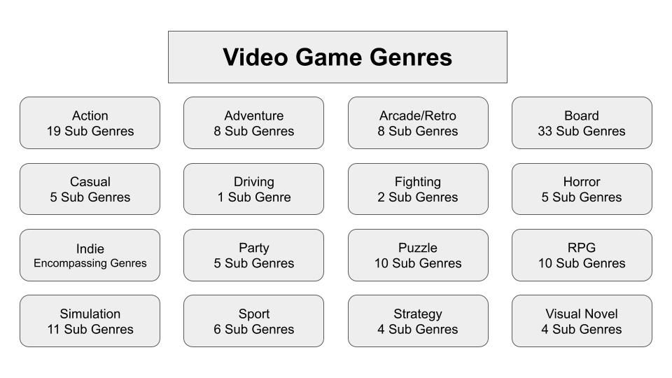
To kick things off, I started this project clueless about where to begin in regards to a starting point of where I saw my final piece going. Usually at this stage, I have an explosion of concept ideas but I was strangely stuck and couldn’t think of anything for the majority of the summer. To combat this, rather than spending days in a spiral of forcing myself to conceptualise a final piece, I decided to expand upon my research as well as notes given to me from my assessment of the last module. I ended that project with a lot of next steps on what aspects of my research I wanted to look further into to help me build up knowledge about storytelling and making a narrative. A lot of those avenues are still being looked into, but I was able to expand my genre research to 2 additional mediums which allowed me to get a broader sense of analysis of how genre works across mediums and how specific the subgenres can get.
I started off by looking at the genres that exist within the video game medium, mainly as I had already previously touched upon them as a body of personal research for data collection and analysis. However, upon deeper inspection, I have found that the narratives that exist within this medium can be the most immersive due to the process of putting a person in the middle of the story and allowing them to control aspects of what takes place. I hope that with this comprehensive look into this medium, I can start to teach myself the ways of coding and 3D modelling to take my practice further and learn how to adapt my narratives to fit within the medium.
Research Expansion – Literature Genre Research
After going through the genres of video games, I decided to jump head first into the sea that is Literature Genres. Before I went into this I only looked at the subgenres on the surface to give myself an idea of how many I would be looking into. However, I was surprised to discover how often the subgenres themselves would branch off to have their own specific subgenres within them. To my understanding, I believe this is since literature itself has existed for centuries longer than the other mediums I have looked into which in turn, causes there to be more splits and precise organisation for more specific subgenres to form. With that in mind, I hope to take this research as a basis to see how genre itself evolves in other mediums while also trying to find new ways to tell stories to maybe someday create my own subgenre like writers that I admire. (For Example, the works of H.P. Lovecraft inspired the creation of the Cosmic Horror subgenre more commonly known as Lovecraftian Horror).
I also hope to look more into the examples I have chosen for each subgenre, planning to dissect them and take notes on their structures, themes and designs to better inform my knowledge and what I can apply to my own narratives. This process has already begun through the collection of all of the cover art/posters used to market and showcase the stories within the examples, with the idea to look closer at the design choices and what patterns emerge from comparing examples that exist within the same genre.

Research Expansion – Anatomy Studies
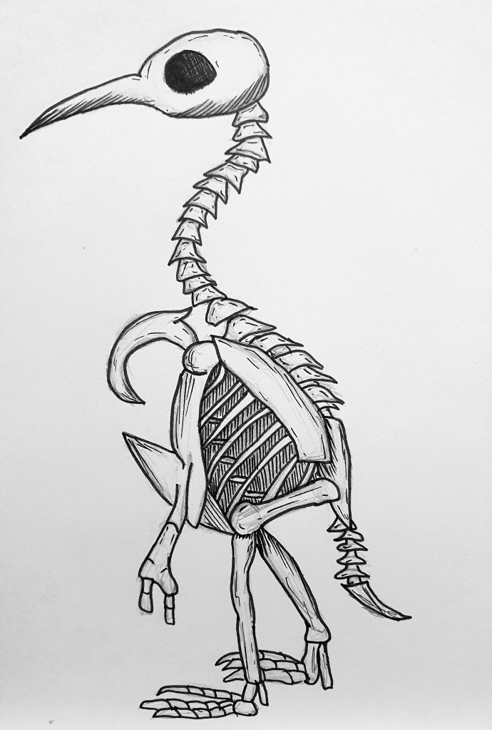
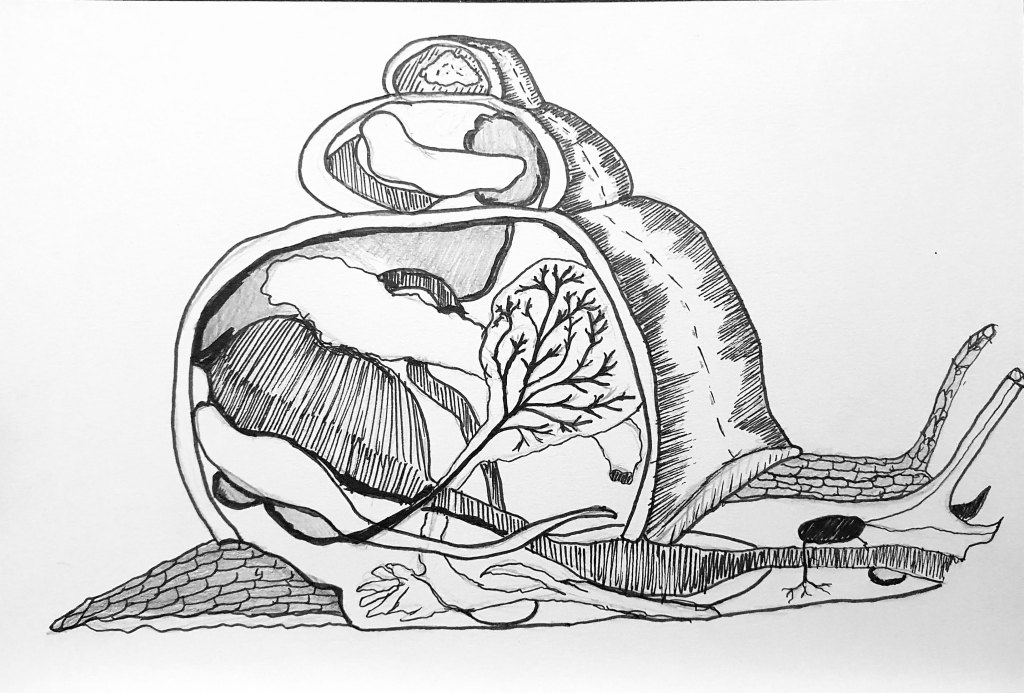
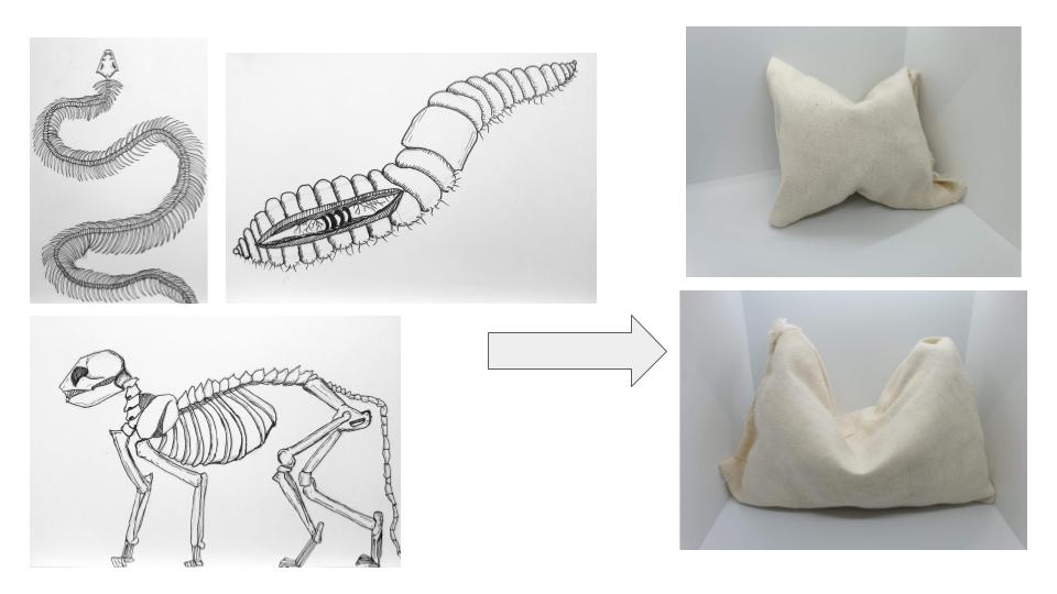
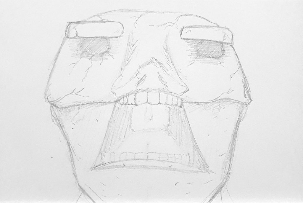
One of the keynotes given to me at the end of the last project was to look into Anatomy. This idea was stated to help better my understanding of drawing a stylised person by taking the base shapes of creatures and configuring them to create bizarrely composed people. With that in mind, I planned to create a series of sketches of characters that closely resembled the physiology of animals which would force the viewer to second guess if it were a person or an animal. To begin, I went about drawing the anatomy of both vertebrates and invertebrates to gain a better understanding of the anatomy of creatures who possessed bones and those who did not.
The intention behind these studies was to take the main attributes of the animals and try to find a way to compose them to create a unique character type whose silhouette closely resembled the animal itself. However, I got to a certain amount of sketches before starting to experiment with the making of my chosen idea for this project so the creation of these characters has been shelved. The hopes are to go back to this study and further develop it by making the characters themselves as well as looking at a lot more complex creatures to give myself an added challenge
All of the illustrations from this anatomy study can be found here:
Idea Mapping
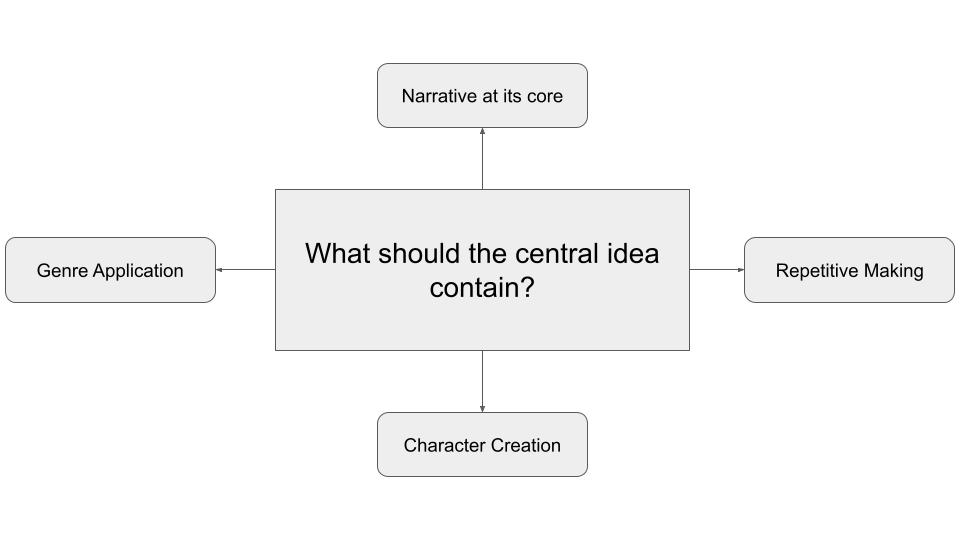
Going into this project, I wanted to try and collate as many topics that make up my core values as an artist. Whether they were skills that I had picked up or aspects that I had lost and wanted to regain, I knew that this would be the project and the best time to put them all together in one place. The main values I wanted to make sure were at the core of the project consisted of all of the research and processes I have spent the master’s degree honing while combining them with repetitive making to create a balance of both illustration and making. However, the most important thing to me was to make sure that the narrative stayed central to the project and was made so integral that it would be impossible to remove. In all of my past projects, I have envisioned a narrative taking place but it has always been dissolved and taken out by the time the final piece comes together. As storytelling was the main reason why I became an artist in the first place, I knew that with this final project within education, I had to put my foot down and make sure the story stays so that I can do the same with all future projects going forward.
Initial Concept – The Human Zoo
I first got a spark of inspiration for what concept I wanted this project to be whilst conducting my anatomy studies, where I kept imagining the characters made from them to be absolute monstrosities. Rather than just having a silhouette that resembled the animals, the characters would possess features of the animals too which would range in varying degrees of explicit extremes such as quills, protruding bones and whole restructuring of the bodies themselves. As an avid fan of horror and all things creepy, I was on board with this concept for a while as I thought it would be great for my first story to be something that would strike both fear and macabre curiosity into people. My original concept notes are as follows;
The Human Zoo – 3D Piece Exhibit Concept
Synopsis
The story follows a mad scientist eager to expand upon human anatomy and trigger involuntary evolutions within their test subjects. By interlacing their DNA with that of random animals, the scientist watched in horror as his subjects’ skeletal structures and bodily features morphed drastically into forms that barely resembled what they looked like before. Do they feel ashamed of their endeavours, or do these changes fuel their ambition to evil degrees?
What I have:
- Anatomy Studies – Skeletal sketches of both vertebrates and invertebrates, looking into detail about how their bodies work and what makes them tick
- Character Designs – With each anatomy study, I create a small sketch of what the humanoid test subject would look like with the hopes of creating full character sketches for each creature.
What I need to develop:
- The Scientist – Who are they within this story, what are their mannerisms that make them unique?
- The Test Subjects – Who were they before their transformations, and how have these changes affected them both physically and mentally
- Scientist’s Motivation – Why is the scientist so adamant about finding new ways to evolve humanity, are they racing against time to cure themselves or just truly mad?
- Character Sketches – Should the sketches themselves be drawn in my own art style or scrawled like the etches of a mad scientist to give the viewer some perspective into how the scientist thinks?
- How to make it 3D? – Ideally the use of puppets to showcase the characters in 3D would be beneficial, further research must be developed to decide what materials and ways to make the puppets would be the best.
- Puppet Presentation – If the test subjects are on display, will they be treated as live subjects in cages or embalmed failed subjects that are kept floating in jars?
- Test Subject Backstories – Were the test subjects willing to participate in the experiments, or were they abducted and tested against their will?
In my mind, I imagined the final piece would be a collection of framed illustrations in the style of scientific anatomy drawings taken straight from the notes of the mad scientist which would showcase the transitions taken from adding the DNA to the human test subjects. These sketches would be accompanied by jars of body parts of the failed experiments to keep as either a reminder to never fail again, or collect as many as possible in the hopes of creating the perfect form which would be an amalgam of all the creatures.
I began to experiment with fabric and texture as a basis for whether I wanted there to be puppets of the test subjects or fabric to create weirdly shaped body parts to dye and put into the jars that would be displayed. These would be what would’ve comprised my repetitive making as the texture within was made with a combination of paper springs (2 long strips of paper coiled in such a way to create springs) and cardboard spirals (recycled cardboard tightly wound up and glued to create cylindrical forms). During this experimentation, it was my first time sewing in years and even dusted off an old sewing machine to see how it feels to make these objects over and over again. However, I remembered really quickly how taxing this process is on my dexterity and knew after 2 pouches that I would not be able to keep going with this process. With that in mind, I decided there and then that this concept would go no further so the story was added to the bank for future use and the sewing machine was put back in a drawer to collect dust again. Thankfully at this point, I had already started writing out my notes and experimenting with making my next concept so I wasn’t at a complete loss.
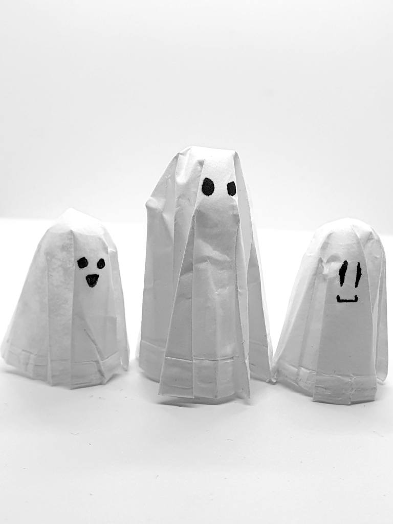
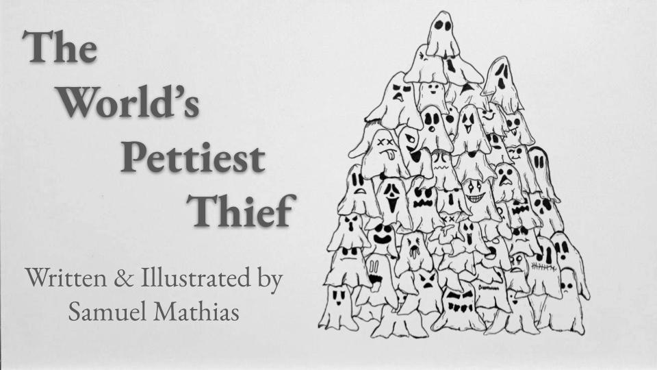
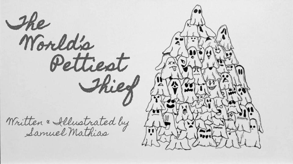
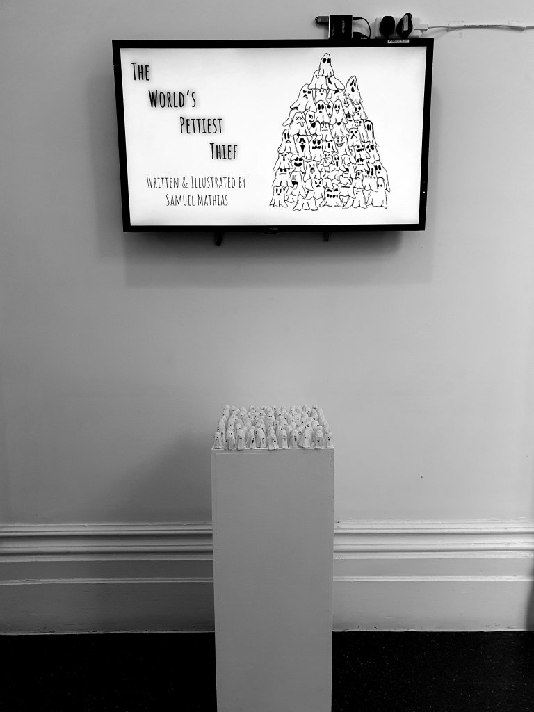
Chosen Concept – The World’s Pettiest Thief
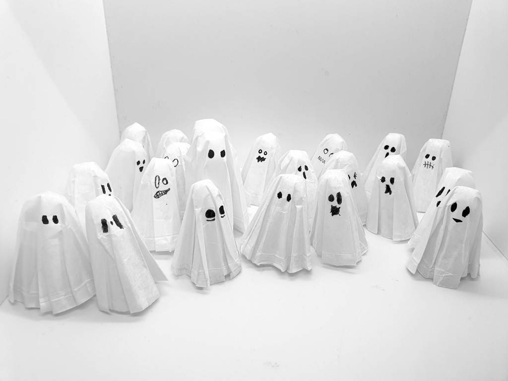
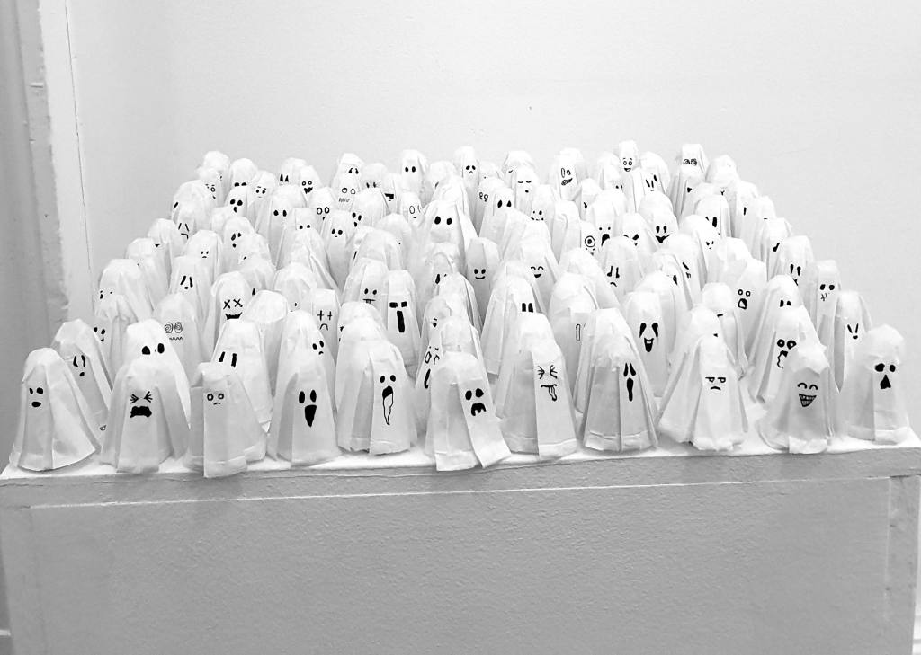
For a while now I have been absent-mindedly hoarding paper cups ever since I found them as usual tools to measure out perfect portions for small batches of paint/glues for projects or spices for recipes. This is probably due to my nature as a “magpie artist” since I love collecting random materials to use them creatively and subconsciously knew that I would find a way to adapt them into some form of repetitive process. After rolling some out and testing different things, I found that just shoving them onto my thumb and forcing their shape into elongated forms turned them into ghost-like figures. All they needed was a quirky little face to give them their own unique personality and bam, I had a new making technique that I could do for hours and hours. Once I nailed this process, I had to physically stop myself from making it as I knew that if I got obsessed with the making I would neglect the story I would want to centre this process around.
The World’s Pettiest Thief – Mass Collection Exhibit
Synopsis
The story follows a thief in their own right, but not to an incredible degree. Rather than focus on stealing valuable art and priceless jewels, this thief takes resources commonly accepted as free items. As the items have no value, you may think that there is no point in calling this man a thief. However, what they do with the things they collect may in fact steal what we all value the most.
What I have:
- Objects of Collection – Amenities that are provided to people for free to have a better experience (e.g. Napkins, Portion Cups etc.)
- Purpose – The thief steals so that they can make Halloween Decorations like they used to with a relative that they recently lost.
- The Story’s Message – Grief never goes away, but you learn to live with it more as time goes on. To the point where you always have something core & precious to remember the person you have lost. Whether it be through memories, visits to where they are buried for weekly chats, or even looking at something beautiful that reminds you of them.
- Presentation of the Piece – A cascading collection of various decorations, a Christmas tree for Halloween if you will (sans the tree)
What I need to develop:
- Protagonist – Who is the thief, and what are they like?
- Protagonist Appearance – Do they wear a costume to blend in, or is their apparel flashy and not inconspicuous at all?
- Lost Relative – Who are they concerning the protagonist, and how did they come to their demise?
- Halloween Decoration Designs – What do they look like, and what features do they possess?
- Tone of Decorations – Are they cute spooky, visceral spooky or a combination of the
- two which showcase a wide variety as well as a transition through life stages?
- Alternate Objects of Collection – What other things does the protagonist steal/collect, and what are they eventually turned into?
- Fictional Operations? – Are the stores in this narrative known to our reality, or are they specifically made for the story?
Normally for projects, I strive to have at least 10 concepts to slowly narrow down and find the one I will eventually choose to continue with until a final piece is made. However, I fell in love with both the story and the making so much that no other concept entered my mind. At this point, I knew that this would be the concept I would stick with and use to showcase everything that I have learnt throughout my higher education. Since I knew that the narrative would be the main focus of the project, the making itself had to be limited rather than spending the majority of the project to see how many objects I could make. With that in mind I will mention that if my main focus were to be on the making, my goal would be to make thousands of these ghosts and either try to fill a room with them or scatter them around the entire venue and create a large hide and seek story surround mischievous ghosts that would rather be sneaky than be spooky.
Artist Research
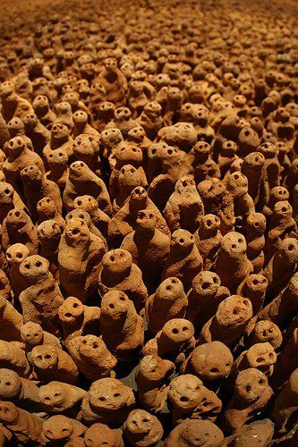
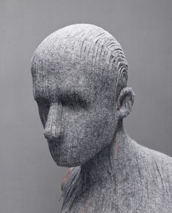
Since my work was going to be based on varying facial expressions and repetitive making, I wanted the artists that I looked at to have a repetitive process that centred around either figures or compositions that grouped elements together in a packed manner. I instantly remembered the works of Antony Gormley when thinking about what works to look at as I have previously looked at their works when working with making multiples of figures for a project in my BA degree. However, Gormley’s work was the only piece I knew that used repetition in such a way so more research was needed to get a broader understanding of how I can arrange my own pieces as well as open my thought process into experimenting with different techniques. The artists that I looked at are as follows;
- Antony Gormley – Field Sculptures [Use of Multiples]
- Jane Frere – Return of the Soul [Use of Multiples + Cascading Installation]
- Levi van Veluw – Material Transfers (Gravel / Carpet) [Composition]
- Chalermchai Kositpipat – Wat Rong Khun [Multiples]
- Jaume Plensa – The Damnation of Faust [Cascading Composition]
- Maxwell Perone – Protection [Multiples]
- Marc Bourlier – Driftwood Pieces [Variation of Faces + Multiples]
- Cristiano Gonçalo – Uncomfortable Toilet Faces Activation [Variation of Faces]
- Jørgen Haugen Sørensen – Congestion at the port of stupidity
- Holly Wilson – Bloodline
- Eva Larsson – Don’t Be Afraid
- Thomas Francisco – Driftwood Sculpture
- Jephan De Villiers – Arbonian Landscape
- Dolores Previtali – Ceramic Sculptures
From looking through an assortment of these artists’ works, I found myself mostly drawn to pieces made by Marc Bourlier due to their use of simplistic facial expressions and how every face can be unique depending on their shape or material. With this in mind, I knew that when it came to my own making I wanted the faces on the ghosts to have varying degrees of expression but also be simplistic and fun to look at rather than complexly designed and overcomplicated.
All of the artists and their respective pieces I looked at can be found here:

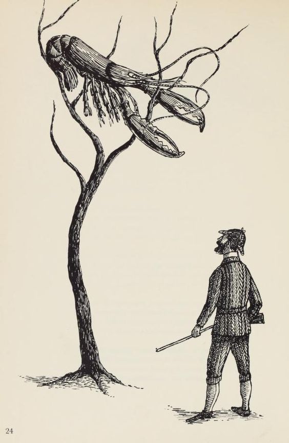
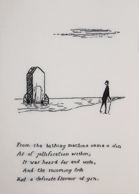
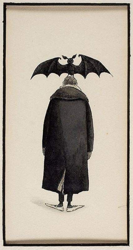
Points of Inspiration – Edward Gorey’s Illustrations
When it came to the illustration style I wanted to draw inspiration from, I wanted to pull away from looking into the usual illustrators I tend to reference and focus on works made by a singular person instead. As my own art style is very prominent for its use of monochrome and varying techniques of hatching and shading to create tone, I wanted to look at an artist who closely resembled those techniques but also helped me better my understanding of what I could do to improve my own drawings. For example, I had a hard time filling shapes with solid black as they would tend to lack depth and just end up looking like flat shapes.
Thankfully I stumbled upon the works of Edward Gorey when looking into new ways of drawing simplistic figures and silhouettes. I found that their technique of using black in such a striking way that held its shape was remarkable and truly inspiring. I also loved the way that the stories he would illustrate would come alive in the way the text was shaped as well as how the characters were utilised within the space that they held. I aimed to try my best to learn from the composition that these illustrations had and gain experience when using these techniques when figuring out the layouts of the illustration elements that I would use for this project.
All of Edward Gorey’s illustrations that I looked at as well as other points of inspiration that fuelled me in the early stages of this project can be found here:
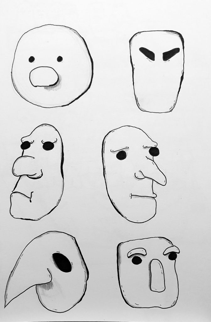
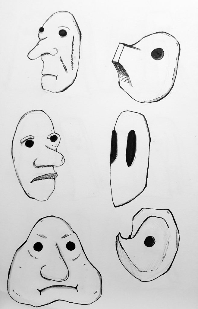
Points of Inspiration – Basel Masks
Ever since a young age, I have always had an interest in masks. I always assumed it was because I loved Halloween and all of the creature masks that would come of it but later in life I realised that it probably stems from the autistic use of masking where my passion for masks lies. As an autistic artist, I have had to teach myself to mask to be able to function in “ordinary” society but I try not to as much nowadays due to the growth of my nihilistic nature and my belief to not care what others think. Therefore when it comes to masks, I mainly see them as a way to hide how you truly feel and be able to maintain a basic expression as a facade.
Due to this ideology, I knew that when it came to my grief-stricken protagonist I wanted them to have a mask as their key feature because I wanted their coping mechanism to be a form of suppressing their emotions and what better way to do that than to lock away their ability to expression. I wanted the mask they would be to be simplistic in nature and force them to only be seen with a non-expressive face, something that showed a face that was dull and unable to feel. While going through my personal research into masks, I stumbled upon the masks of Jacque Lecoq who used neutral masks within their practice of movement acting. These masks would be given to the performers to give them a neutral or forced expression when conducting set movements on stage to allow for the movement to have a prominent focus without the emotions getting in the way.
After drawing a few select examples of these masks, I went about designing a few of my own to figure out what kind of expression would be best for my protagonist. If I was trying to focus more on making within this project, I would’ve started experimenting with monster clay to try and create a 3D form of the mask itself to draw inspiration from. However since I wanted to focus more on the illustration side of things, I decided to not go in this direction which is probably for the best since I was never really good at ceramics and sculpting faces in the first place.

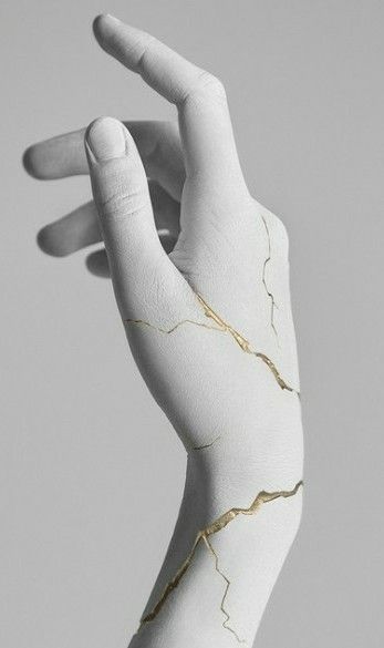
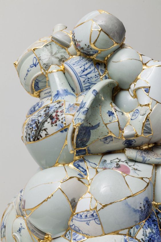
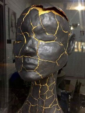
Points of Inspiration – Kintsugi
The practice of Kintsugi was first introduced to me on a trip to London in my foundation year. I can’t really remember which gallery the method was shown in but the fascination with fixing broken things with luxury material stuck with me for being so beautiful and bizarre at the same time. Rather than typical methods of fixing pottery to best match the original product and hide the damage, Kintsugi highlights the cracks as a part of the life of the object and chooses to showcase the flaws and imperfections instead of masking them.
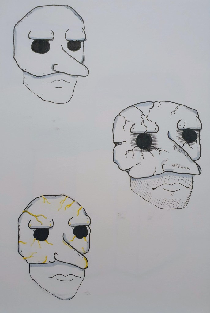
This philosophy inspired the ending of my story which originally was going to have the protagonist re-enter society like nothing had happened but kept the ghosts with them as a memento to remember the loss. After being reminded of kintsugi, I realised the story would be more profound if the protagonist reclaimed the meaning of what the mask meant and fixed it using this practice to highlight these darker stages of their life and serve as a reminder to never tread down those routes again. Using this practice was also a way to include a splash of yellow into the illustrations which I thought best for the restoration of the mask. Rather than have the mask be fixed with powdered silver or platinum so that it could stick with the monochrome colour palette, the use of yellow in the story would resemble the emotion of joy entering the protagonist’s life again rather than being buried deep down which would showcase as the first step towards reclaiming their life in the light.
Literature Research
As this was the first project where my story would be vital and central to the project, I knew that I had to look into literature that handled themes of grief to give myself a better understanding of how to write around the subject. I didn’t really know any books about grief at first but I found that at the start of my research, it was difficult to find books on grief that were based on a narrative due to the majority of books that deal with grief are self-help books. Since I wanted the themes of grief to be told through a fictional format, I needed to look deeper into the subject and find examples that did not fall into the self-help category. The books that I looked into are as follows;
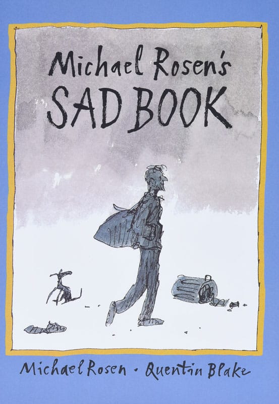
- Sad Book by Michael Rosen [Death of a Child]
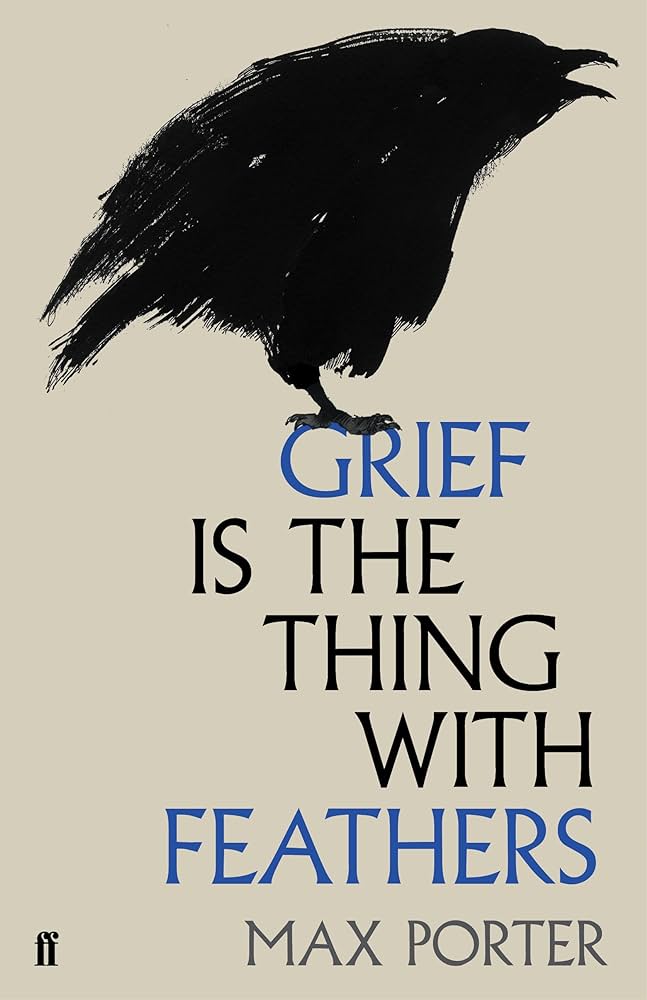
- Grief is the Thing with Feathers by Max Porter [Death of a Parent]
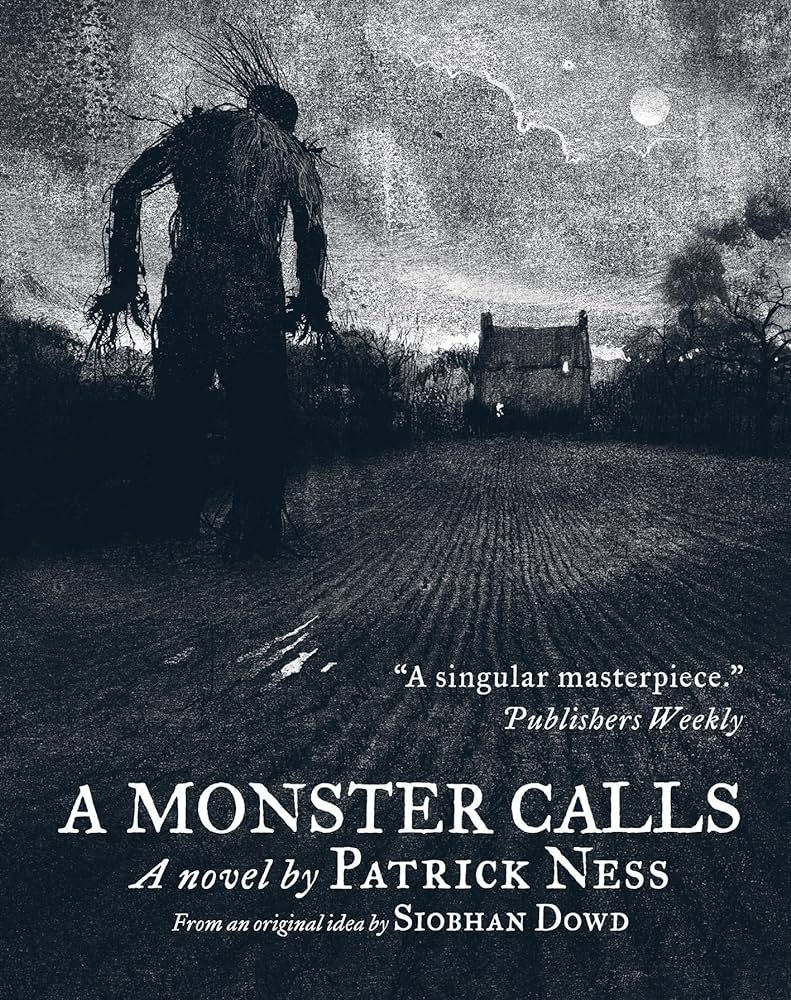
- A Monster Calls by Patrick Ness [Mother falls sick]
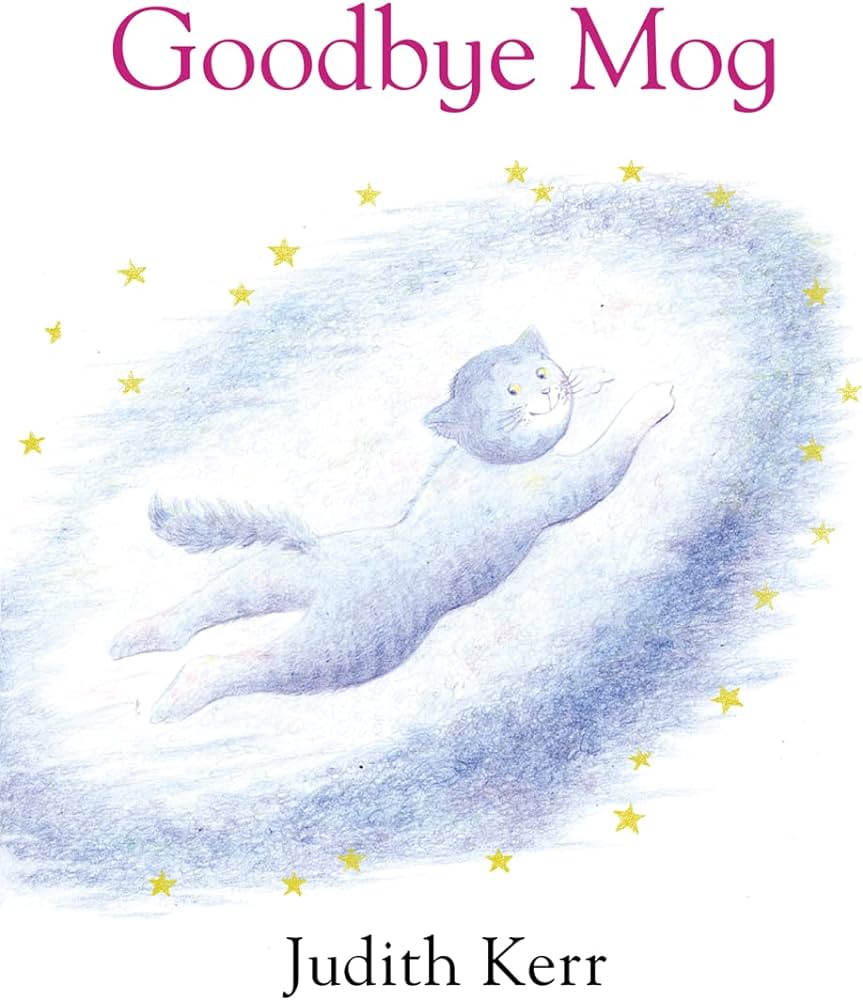
- Goodbye Mog by Judith Kerr [Death of a Pet]
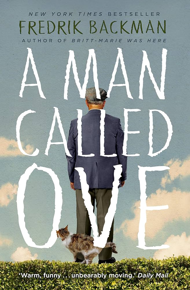
- A Man Called Ove by Fredrik Backman [Death of a Spouse]
I wanted the books that I looked at to range with different audiences, as well as showcase a difference in literature styles because I wanted to make sure my own story was as accessible to as many people as I could but still holding true to what kind of story of grief I wanted to tell. My main sources of inspiration were the books Grief is the Thing with Feathers and A Monster Calls which were narratives that were centred around the protagonist coming to terms with the loss of a parent. However, I also wanted to give special mention to A Man Called Ove which tells the story of a grumpy man coming to terms with life after the loss of his wife and accepting happiness back into his life. Both the book as well as the film that I watched earlier this year managed to get me to fill buckets with tears which is commendable since evoking a strong emotional response from me can be quite tricky, especially if that emotion is sadness.
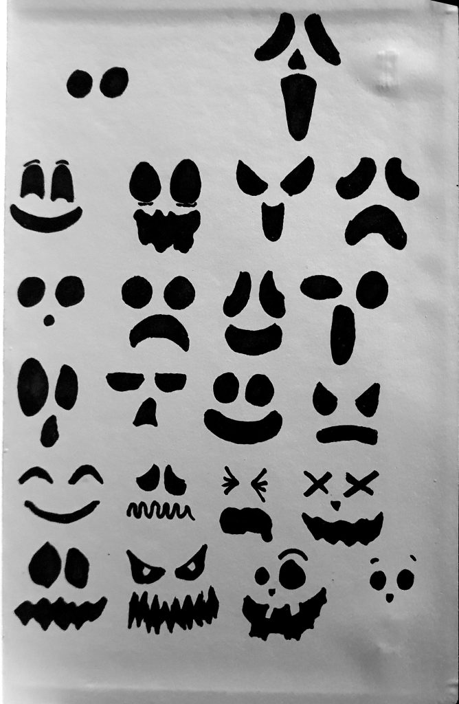
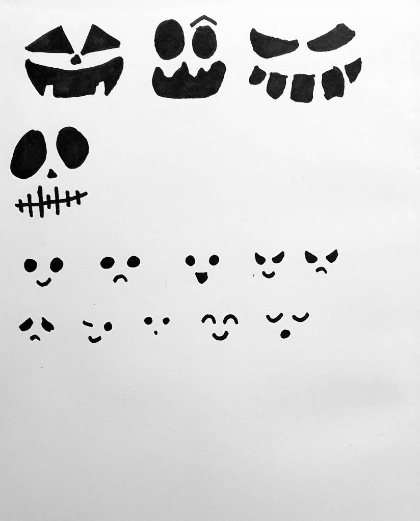
Drawing Practice – Ghost Facial Expression Experimentation
After making about 20 or so ghosts, I ran into a problem where I was beginning to develop same-face syndrome and just wanted the ghosts to be simple forms with 2 circular eyes. Since I wanted my ghosts to be more dynamic and have a range of expressions, I took it upon myself to just draw random basic shapes to get a sense of what kind of faces I could make. Due to this point in the project taking place around the time of Halloween, I found myself drawing inspiration from a plethora of decorations that were beginning to pop up on store shelves. I took elements of jack o’ lantern designs as well as more complex scary shapes to give a further range to my already explored faces. This in turn would create a sense of evolution amongst the ghosts themselves, where as the protagonist would grow darker so would the expressions present on the ghosts.
The basis of this process of collecting facial expressions was to randomise certain features to create a limitless amount of faces, but even when making I still gravitated to drawing my favourite faces onto the ghosts themselves. Thankfully I was still able to keep a set amount of variation to the faces themselves but if you see duplicates then now you know why, it is just in my nature to repeat patterns I like.
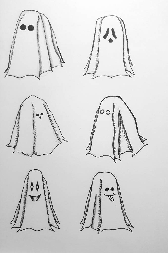
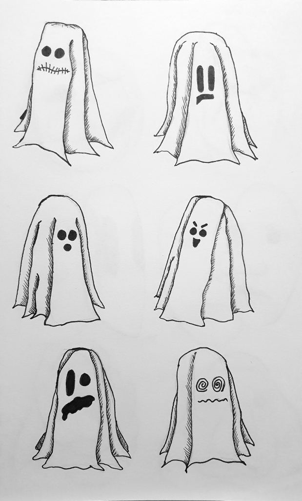
Drawing Practice – Ghost Sketches
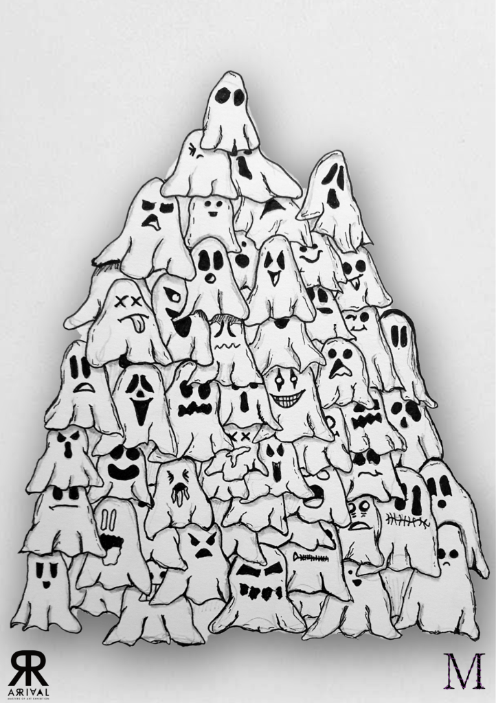
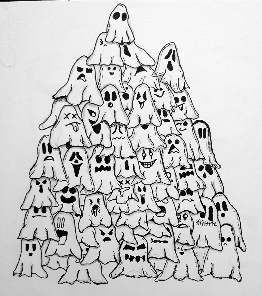
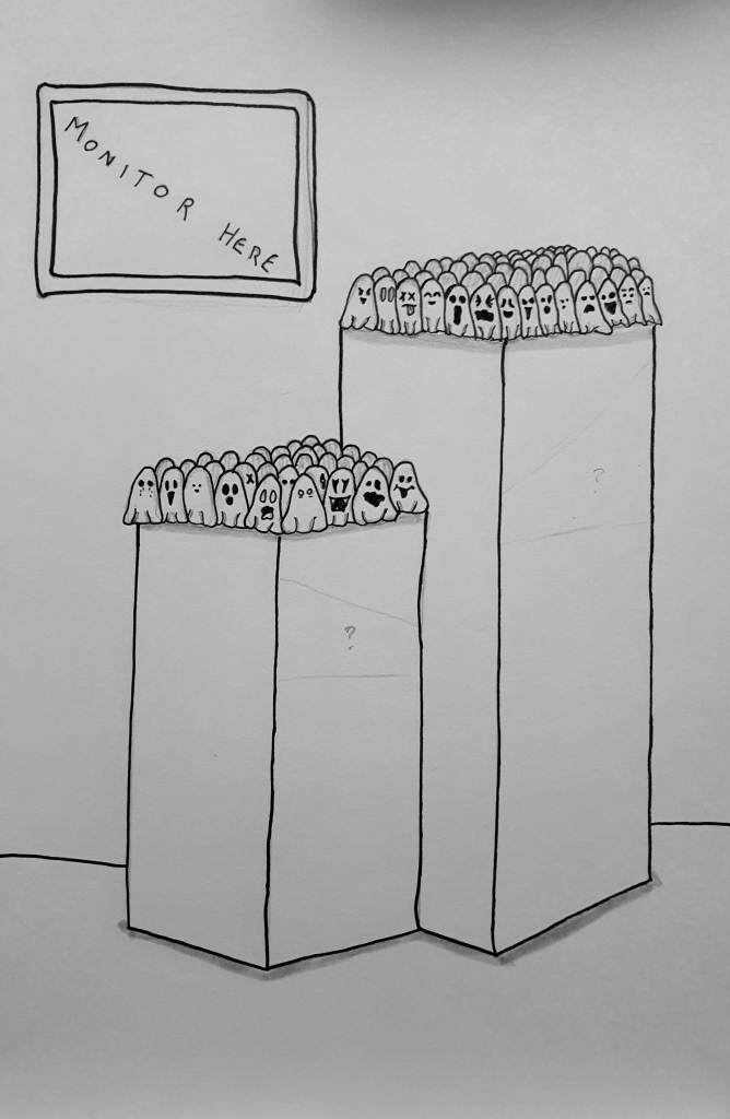
Once I had built up a significant body of ghosts, it dawned on me that if I was going to write and illustrate a story surrounding them then I should probably know if I can draw them. Since I was practically a pro at drawing their faces at this point, I knew that I had to focus on the form of the ghosts instead. So I began a few case studies to draw the ghosts at different angles as well as take note of the shadows of the folds to make sure their shape wasn’t lost in my sketches. After filling a couple of pages with them, I decided to try a drawing exercise of just stacking the little buggers on top of each other, attempting to create a “Where’s Wally” kind of effect where the ghosts pile together into clusters to see how they would all look jam-packed together.
As at this point, I wasn’t entirely sure what I wanted the making part of my final piece to look like, I did have a vision of a Christmas tree of sorts fully comprised of ghosts. I thought it would be quite fitting as the exhibition would take place around Christmas time as well as ghosts having a strong theme to Christmas in terms of The Christmas Carol. However around midway through the project, I decided on a more simplistic approach for the making as I wanted the story to take primary focus and didn’t want the making to be outside the story. Although this design didn’t come to fruition, I loved these illustrations too much to let them go so I decided to incorporate them into the story itself. The individual ghost sketches were taken and arranged to create the border of my end card whereas the clustered composition was used as my title image as well as my main identifier in my exhibition card designs (More on those later, no skipping ahead).
Drawing Practice – Inktober 2023
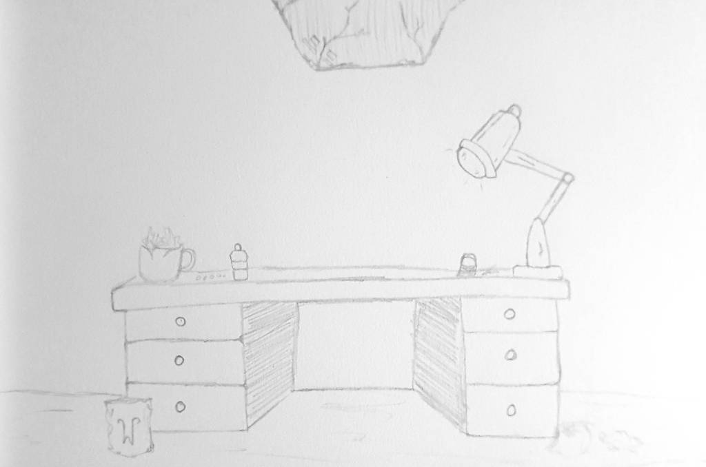
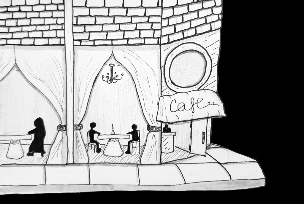
For the past few years, I have been using Inktober as a way to rekindle my love for illustration and storytelling by utilising my drawing practice in creating characters and creatures based on daily prompts. However as this year, Inktober fell right in the middle of this final project, I wanted to focus more on drawing objects and scenarios as a way to practice drawing backgrounds, objects and other elements that I wanted to use for the story. With that in mind, I will say that it was a challenge to come up with unique objects every day so some prompts ended up as characters and creatures. Although these were not my typical forms of illustration, I still enjoyed every prompt as I learned a lot about shape and texture. I also find myself getting prouder every year as I see how much my art style has progressed since the last attempt at the challenge.
All of the drawings can be seen in the montage, but for more in-depth backgrounds about each drawing you can find them all here:

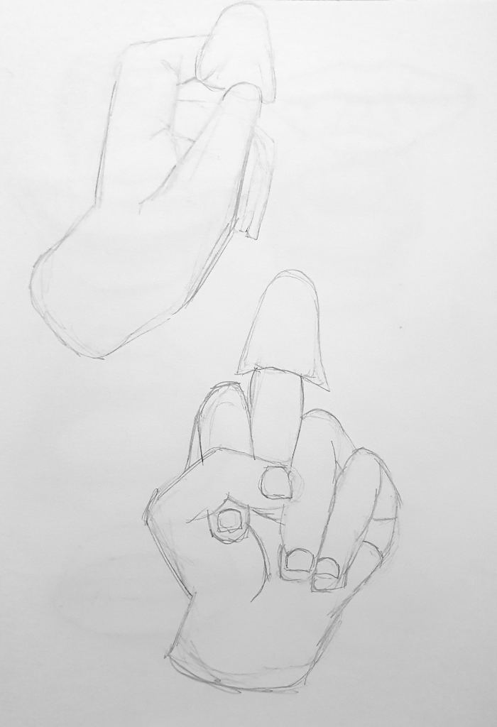
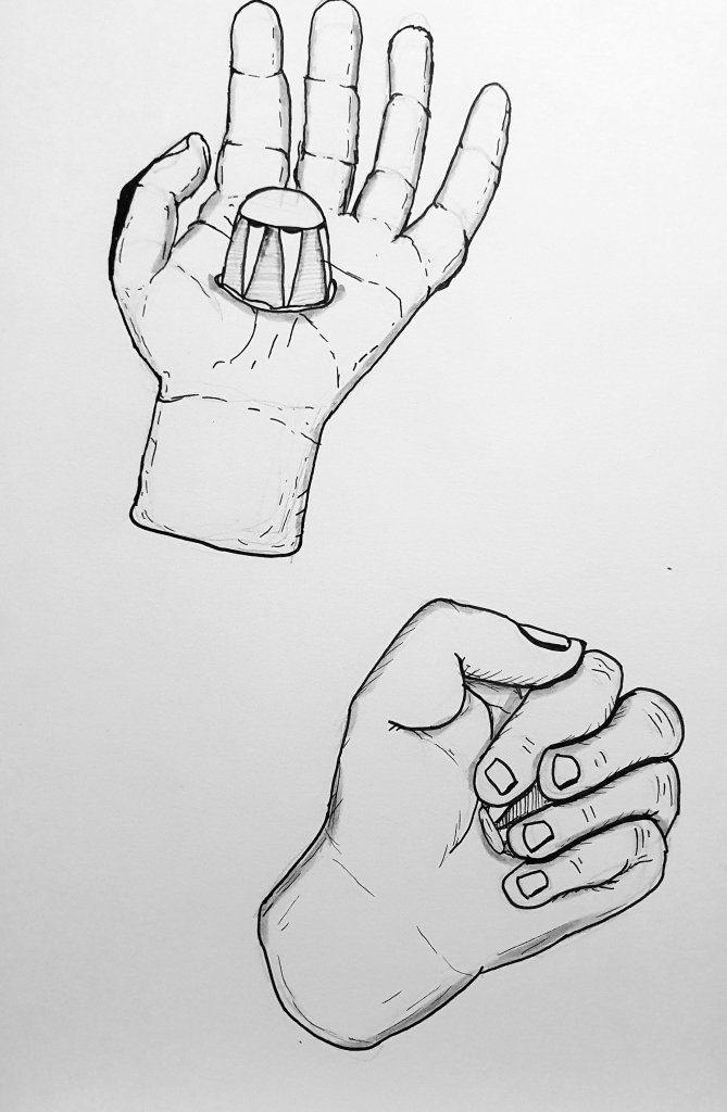
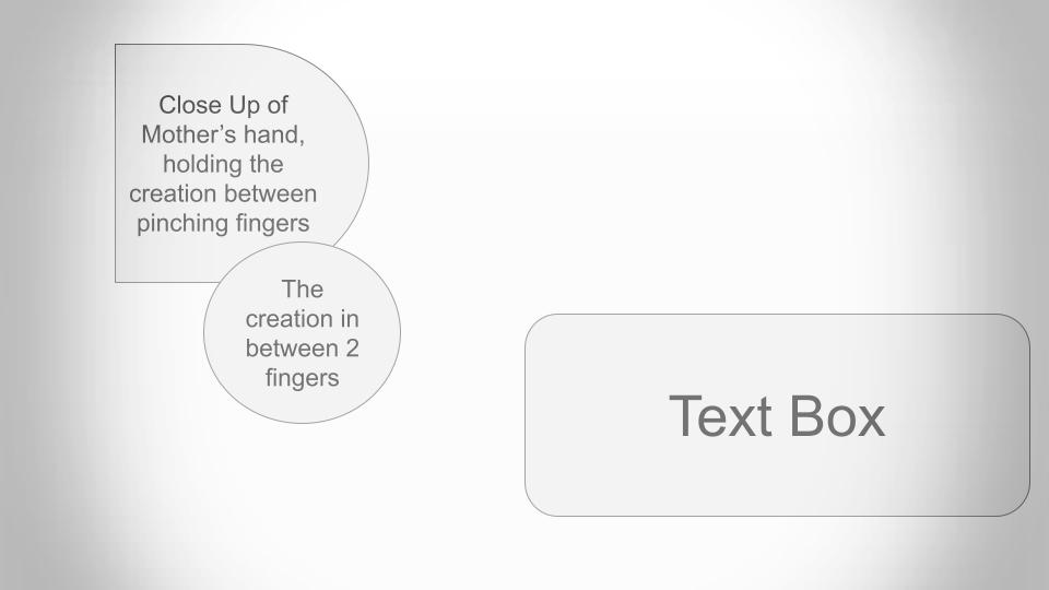
Drawing Practice – Hand Position Studies
At this point in the project, I had already decided that the medium I wanted the story to be showcased was animation. I made this decision as I wanted the story to come to life and felt like animation would be the best method to do it, plus there is the added bonus of animation being a repetitive process of its own which added to the core values of maintaining repetition in my work. With that being said, I knew that there would be certain scenes with the focus being on hands holding the ghosts in different ways. That is why I decided to create some hand position studies where I held the cups the ghosts are made of so that I could both gain perspective on how the sizes of the ghosts compare to the scale of the hand and also allow me to practice drawing hands in general as they can be particularly difficult to draw.
Drawing Practice – Mouth Expression Studies
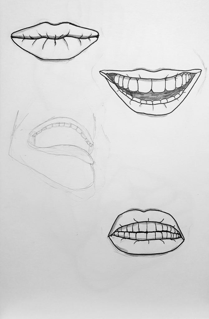
When it came to the story itself, I knew the protagonist would be wearing a mask for almost the entirety of the time. This meant I would have to be creative in the way I would convey the emotions of the character, especially if I wanted the emotions to be key to how the story is told. Once I had figured this out, I decided that a lot of the emotion had to be expressed through the mouth since I thought they would be the best avenue to showcase raw emotion. Since a segment of the story would be based around the mask breaking half to expose this area of the face during pivotal moments of emotional expression, I thought it would be best to conduct a series of studies that showcased a range of emotions that can be easily identified with just the mouth. Even if I didn’t end up using all of the expressions within the story itself, having this many studies helped better my understanding of measurements as well as the perspective of all the elements of the mouth when used correctly.

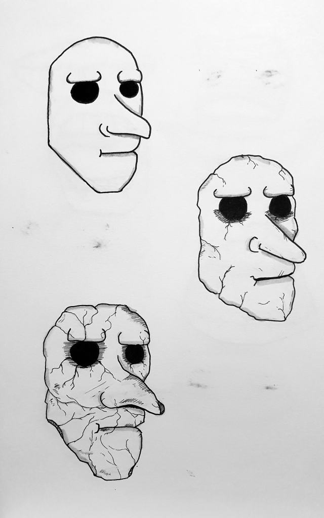
Drawing Practice – Progression of Mask Decay & Restoration
Once I had the design of the mask I wanted to use for the protagonist planned out, I set about figuring out the way it would begin to decay and crack as time went on. I knew that the mask would end up grubby and chipped but I wanted to accurately show how the cracks would form to create prominent damage that would cause it to eventually split in half the way I would want it to. I started by focusing on a central crack that would from directly across the mask starting at the sides and slowly working its way to the center under the nose. I then began to add extra cracks and chips around the sides of the mask as general wear and tear from the mask being worn for so long and having to be readjusted over time. Once those elements were in place, I added a few more cracks that would emanate from the eye sockets that gave the mask a more piercing look as well as resemble tears that the protagonist has yet to cry, foreshadowing the colossal release of emotion they have yet to unleash.
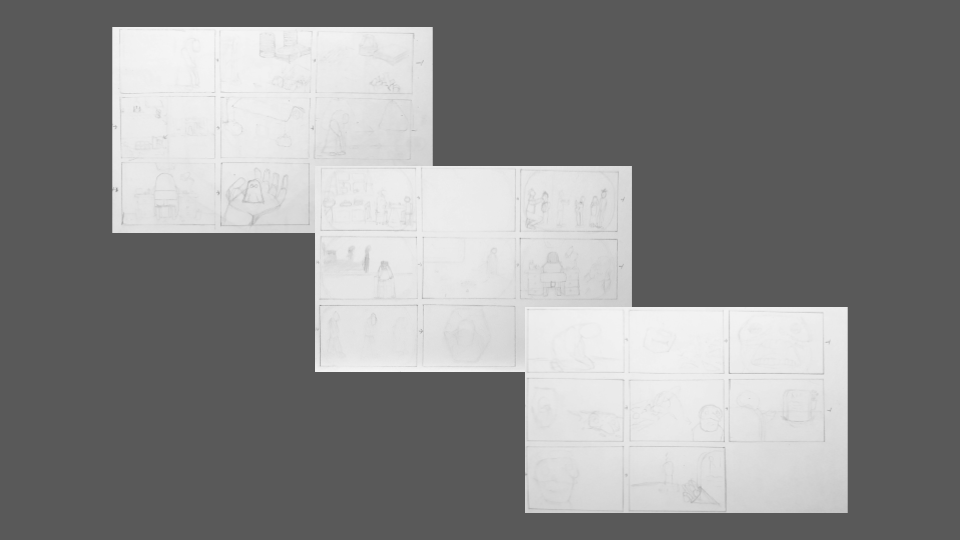
Storyboarding
Once I knew that animation was the chosen medium I was going to use to tell my story, I set about trying to figure out what I wanted each scene to showcase. I didn’t have much knowledge on storyboarding going into this project, all I really knew was that you drew rough sketches into boxes to add to and develop. After some brief research, I found that depending on the chosen medium the amount of detail can vary with how the storyboards are presented. For example, in the case of animation, the storyboards tend to lack detail to have more focus on showcasing the movement of elements between frames, whereas storyboards in mediums like Film and Video Games prefer their storyboards to be more refined and detailed so that it is a lot easier to compare them to the shot lists and perceive how the elements come together.
Since I wanted to incorporate my narrative research, I based my narrative around the 3 act structure and split my story into 3 parts. I also took inspiration from the 7 basic plots and found resemblances to my story in the plot of Rebirth where an event forces the characters to change their ways and often for the better. Once I had split my plot into 3 core chunks, I thought it would be best to do 8 scenes equally for each which would equal the total of a round number of 25 scenes when the title page is included (this was before I even came up with the idea of including an end card). At this stage in the project, the whole story was stored in my brain in flashes so I already knew what I wanted each scene to entail even if I didn’t have the full story written down. Therefore it was relatively easy to roughly sketch parts and in what way I wanted the components to move on the page.
Composition Tests
Once I had all of the scenes planned out and roughly sketched into storyboards, I started to plan out how I wanted the elements to be composed in a digital format. Now I have 0 experience when it comes to animation, so I had no knowledge of the skills as well as what programs to use. The only experience I had was with the animation capabilities of PowerPoint/Google Slides, which I am very comfortable with to the point where I saw myself using it as the primary software to create my animation. Plus at this stage of the project, it would have been a tremendous feat to learn a whole new skillset and still manage to complete the animation in the way I would want to. So I decided to go ahead and create composition tests within the program to test the limits and see if it was truly the best program to use. The worst-case scenario was either learning a new program or scrapping the animation entirely to go down the route of a physical copy of the book.
Now this choice had its fair share of ups and downs when it came to putting all the pieces together, which I will discuss in this section as making a whole new section to discuss the problems would be redundant as I am already discussing the process now. However, I will start with the praising as it ties in with the actual composition tests where it was incredibly simple to mock up shapes of general elements and position them freely where I would want the illustrations to go. Whereas when it came to the transitional animations that allowed the elements to move, I wanted a sort of choppy staggered movement that resembled images fading in and out of the mind which I found with the fade effect. This allowed me to make the illustrations look as if they were coming to life on the page as if they were appearing and disappearing on a single page rather than being still images across many pages.
As much as I can praise my comfortability and accessibility to this software, it also came with its fair share of problems which were expected as I was using this program in a way it was never intended to be used. The main problem I became faced with was the way I could format my text within the story as there is no physical way to have the text fade in sentence by sentence within one text box. The only way this would be possible is if the text was paragraphed which would have completely reshaped my pages and how I wanted the scenes to look when compared to my storyboards. I tackled this problem by breaking the text down into multiple pieces and assorting the alignment of the text itself so that they would fit together like jumbled-up jigsaw pieces. This step was crucial and saved me a lot of time in the long run, as other methods to complete this task would be to create screenshots of the text morphed into a text box shape that would fit the appropriate scene. Thankfully only a few scenes crucially needed this process, since most scenes with text were easily reworkable to have cuboid text boxes that didn’t need to be reworked.
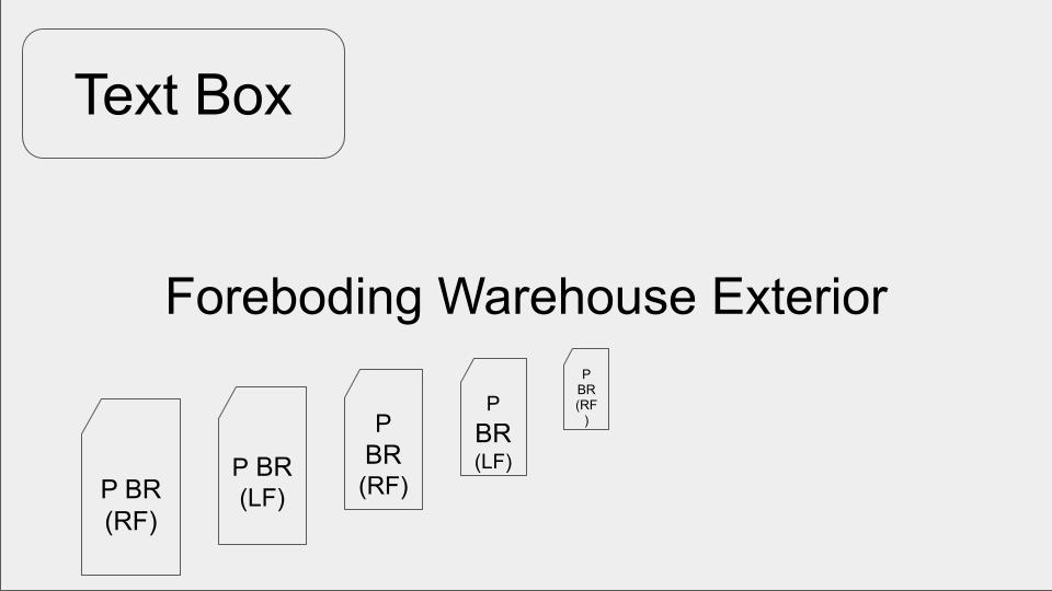
Initial Sketches for Elements
As I have never really been a fan of sketching in sketchbooks mainly for the inability to move around the pages as I see fit, I went about my usual method of drawing on A5 cards to sketch out all of the elements. Rather than make a round of rough sketches and then a round of clean sketches, I decided to treat the initial drawings as tests that I could draw on top of if I deemed them worthy. That is why I tried to create as much depth and detail as I possibly could with a pencil before moving on to create more with pens. This also allowed me to perceive if certain scenes had to be split up for elements to be separated rather than be one whole conjoined setting. For example, the picture on the right was turned into 2 separate drawings as I wanted the dinner table with the characters to fade in after the kitchen was put into place. It also allowed me to change details that I felt better made sense for the story, like how I envisioned the protagonist to be younger at this stage of the flashback sequence so I changed them from sitting in a chair to having smaller proportions within a high chair.
Inking Process for Illustrations
Once all the illustrations were sketched out, I began to go over them in ranging thicknesses of black pen to help develop a sense of depth depending on the layer I worked on. I mainly stuck to finer pens for details and patterns whereas I opted for thicker pens to fill out blocked silhouettes or outlines. I didn’t want to use my typical cross-hatching technique for filling out shadows so I chose to blend pencil to create a fuzzy texture if the drawing required fabric like the dressing gown of the protagonist. To help give a sense of 3D and allow for the illustrations themselves to pop off the page, I used a variety of grey-toned pens to add layers of shadows under elements such as arms and clothes.
When it came to using the inked sketches for the animation, I didn’t want to just scan in the illustrations to use as it would basically just be a bunch of moving rectangles which would eliminate any sense of immersion or magic created by the movement. That is why I chose to put all of the elements through editing software to remove the backgrounds themselves so that they were their own defined shapes. This process made it as if I was working with cut-out illustrations to align and animate which closely resembled processes found in Cutout Animation, a technique popularly known in animated projects like South Park and Fantastic Planet. However, the AI used to erase the backgrounds of my drawings wasn’t always accurate so for the majority of them, I had to go in manually and restore/remove parts to make them be the defined shapes I needed them to be.

Font Selection Process
The final part of putting the animation together was to write out all of the text, which in itself was fairly easy as all I needed to do was fill text boxes in the positions where they were within the composition tests. However, that had its own problems as I mentioned before with the janky jigsawing together of text boxes to create a cohesive paragraph that was animatable. The only real challenge to figure out was finding the perfect font that fit the story that I wanted to tell, something that had its own personality on the page while also being readable and not boring to look at. I kept in mind that I had to have bookish fonts as potential options in case I was forced to have proper readable text, but thankfully that wasn’t a restriction I stumbled on so I was free to look through as many fonts as I deemed possible. To make sure I did a thorough inspection of what kind of fonts were out there I could use, I went about and looked at around 31 different font types and narrowed them down based on a rubric of Flow, Readability and Unique Texture Quality.
I wanted the fonts to be easily readable and flow nicely on the page, but I didn’t want it to be overly flowy as it would both tarnish the readability and make a strange aesthetic that would not match the story. The font I went with had a perfect quality that had a sense of eerie to it that I believed would be the best choice for a story with themes of grief and loss, kind of like ghost lettering or an aesthetic quality that reminded me of Where the Wild Things Are. The pictures below are my top five choices for my cover page, ranked backwards in order of preference.


Final Animation
And with that, all that was left to do was to put everything together in one place and boom animation done. Of course, due to the fact I wasn’t using proper animation software to make my animation, I had to create an unconventional way to have my slideshow come out as an actual film. To achieve this, I recorded my screen using OBS and manually clicked through the slideshow at a steady pace. To make sure I correctly timed myself, I read the story out loud to myself as if I were reading it to a group of children like a bedtime story. Since I am a very fast reader, I chose to speak my story aloud so that I didn’t progress through the narrative too quickly.
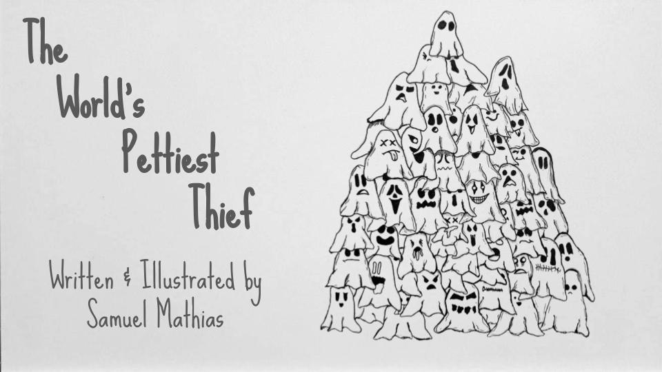
Exhibition Layout Plans
When it came to how I wanted the actual exhibition space to be laid out I had a clear plan of how I wanted it to look from the get-go. Since I wanted the animation to take the main focus, I knew that I had to limit the amount of making and keep it to a minimal use so I thought the best way to pull this off was to group them onto plinths. The plan was to make enough to fill the surface area of a couple while the animation would play on a monitor on the wall. However, I also wanted to play around with the concept of having the ghosts themselves move around the space and see what they would look like if they were full of life and mischievous. This would then lead to them running rampant all around the exhibition, hiding in peculiar places and getting mixed up in all kinds of shenanigans. As much fun as this concept would be, since the ghosts themselves don’t have minds of their own within the confines of the narrative it didn’t make much sense for them to be that way as a part of the exhibition.
Giving the Ghosts some Bones
An unexpected dilemma came from actually making the ghosts stand on their own, as it was considered to be a challenge in itself. Normally they can stand on their own but I needed to give them a bit more core strength if they were going to stand the test of time being on display in the exhibition. My mind went to using plastic holders to put them onto but I couldn’t find any that could fit the size of the ghosts themselves which left me with no other choice of making their skeletons myself. The process I landed on was scrunching up tin foil into these monolith-type structures for the ghosts to sit upon when put on display. With these in place, they were able to withstand a hefty flick without falling over so in theory they could withstand potential prodding and poking from random passersby. The main issue was tackling the potential domino effect that could occur when one ghost is knocked over with such a force that the other ghosts would fall over and end up creating a disaster. I chose to go with blu tack to stabilise the skeletons to the plinth as it’s a sturdy adhesive, but after having to peel every glob of it off of the plinth myself I now wish I had gone with double-sided tape as a more easier-to-clean stabiliser.

Final Outcome – Arrival Postgraduate Degree Show
As far as setting up for the exhibition goes, I can’t exactly remember the finer details. Due to the whole process of setting up and exhibitions, in general, being a strong influence on my shutdowns, a lot of the process has been blocked out of my mind as I tend to get overwhelmed by the number of loud noises. Thankfully I was prepared with 2 layers of ear protection as well as a chair to help take short rests if I found myself on the verge of shutting down. All I can really remember is splitting the plinth into 8 segments with blutac as well as surrounding the edge with blue tac too so that there was a sturdy rim to hold the majority of the ghosts. For the ones that weren’t stabilised with blue tac, I still implanted them with tin foil skeletons and clustered them in the gaps between the sectors so that even if one was knocked over, they had stable walls to not completely wreck the entire grouping of ghosts.
Exhibition Card Designs
For the marketing materials, I knew that the main focus would be on the clustered ghost sketch as this was my title page piece as well as the most visually appealing illustration that I made for the project. The back is just a basic assortment of information which showcases my brand logo, a brief abstract about my praxis, and my social links to all the different accounts that are linked to my art. I mocked up all the elements within Canva and used Banana Print to make the cards as they were the same company I used to create the cards I had made for my BA Exhibition. They turned out a lot better than expected to the point where I am considering a similar layout change when I remake my business cards.